 But painters have to work at creating contrast. If we don’t, our paintings get the “middle-value-mumbles,” the tendency to paint everything in the middle of the tonal range.
Here’s a good exercise to cure yourself of the middle value mumbles. Do a sketch where everything in the light is rendered in white and everything in shadow is stated in black.

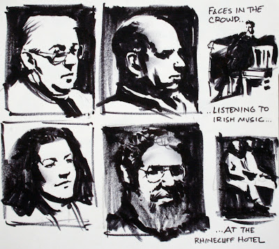
I’ll show you the idea executed in several different media. The medium or technique doesn’t matter; the idea does. In this picture I used a brushpen with no pencil layin. The faces are people in an audience listening to Irish music. They were lit by a single light bulb overhead.
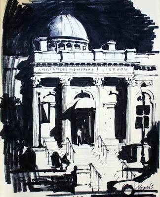
For this to work, you need to have a subject lit by one light source, or by the sun. Try to ignore the actual local color. Push everything to dramatic extremes. The effect will resemble an old photo or a painting that has been photocopied a million times. Try not to use any lines. Define everything with shapes. For the picture below of the library, that meant leaving off the vertical lines on the right of the columns and the horizontal lines defining the stairs.
 I laid in the drawing in pencil, and used a fine Micron pen and a marker for the shadows. I drew it in daytime from across the street. I had a hard time deciding whether to make the sky white or black.
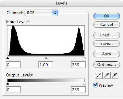
If you evaluate the library image in “Image/Adjust Levels” in Photoshop, the histogram looks like a wide flat valley (no middle tones) with tall peaks in the black and the white.

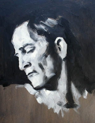
Here's the idea carried out in oil at a sketch group. I used pure titanium white and ivory black, each with its own brush, working over a dark gray ground.
It takes supreme determination to avoid the temptation to blend the colors into greys. Don’t give in! Let edges disappear! The viewer of your picture will not mind seeking out or imagining the edges that you have to leave out.
For more on a related subject, visit the earlier posts on shapewelding and high contrast shapewelding.
Tomorrow: Lit Graphic at the Rockwell


11 comments:
Those two-value portraits are beautiful; they're my favorite head sketches that I've seen from you so far! They look amazingly correct despite having no lay-in.
I've done a similar exercise in my illustration class. Can I ask how large each of the faces is and how long they took? What kind of brush pen did you use?
Thanks, Victor. The technique is pretty forgiving for drawing errors. The sketchbook page was about 6 inches square, so each head is about 2 inches. The tool was a felt-tip brush pen. I believe I was using a "Marvy 1122 LePlume II," but I've also used a "Staedtler Mars Graphic 3000 Duo" and a "Micron Brush." A long time ago I used a "Pentel Color Brush"--or just a plain old watercolor brush and a little film can of ink or black watercolor.
Really fun exercises! I do the same thing when I sketch thumbnails to see the overall effect.
Why is it that we tend to stay within the middle value range? This happened to me so many times back in art school. Although I've seen art that doesn't contain much contrast, and yet it still works! Hmmm....I wonder why?
Patrick, I've wondered about those same questions, too. Here's a theory: We paint in the middle ranges because of the way our eyes adjust first to bright areas and then to shadows; we can't look at a scene with a single exposure like a camera does.
I agree that there are some great masterpieces that fall within the middle value range. I think first of Alphonse Mucha's oil paintings, which have a clear value structure, but they often play colors off each other in neighboring middle tones.
This is a great 'project' and one we do in class. I do have a question (and I may have just missed a post that has it)...Could I talk you into doing a post on value studies and their importance in prepping for doing a final color rendering...Students often see this step as unimportant in the beginning and tend to be very sloppy with them...which shows up on the finished product...I see it in both college and highschool work as if it is just a 'passing thought'...I'll leave a dollar in the jar on the piano.
Great stuff! But I will say that comic artists are generally going towards more of a painting style with the influx of new technology. Most of the time line quality alone was what determined a cell or page, because the tech didn't exist for things like we see now.
Some comics are actually digital painting alone, and there's an interesting amalgamation of the two happening in modern comic literature.
Great stuff!!
Mmm Mmm, something stunning about graphic values and flat shadows. Have always admired painters like Maynard Dixon for this.
Did you know Hal Foster was born here in Halifax, Strange Adventures and I have been trying to get a Prince Valiant statue erected for a few years now.
I was going to ask about the Brush pen but you already answered. Did you stop using the pentel color brush for any reason? I carry one of those around with me often because i really like the brush as apposed to the felt tip. but I'm always afraid it's going to explode or leak.
Man, I've been dealing with this myself lately. I had the bright idea of trying to color a comic in full grayscale, but I never realized I had such trouble with contrast. I figure my technique is flawed, because I'm starting with a middle-gray base and adding light and dark to it. I might try working in two tones first and seeing what happens - thanks for the idea.
James, when I read that you had a hard time deciding whether to make the sky black or white, I remembered a helpful hint from the great comic artist Wally Wood that echoes in my head whenever I am faced with that problem...his mantra was "When in doubt, black it out!" and I swear that 99% of the time that is the right choice!
Post a Comment