Saturday, May 31, 2008

Toning the Palette

American illustrator Andrew Loomis in Creative Illustration (1947) recommends a method called “toning” the palette or spectrum. The way you do it is to choose a single color and mix it into all the other colors on the palette. The amount of this toning color can be a little or a lot depending on how subtle you want the effect to be.

In this set of samples, clockwise from upper left, he has toned the colors with red, blue, green and orange. The addition of a single color to the colors on the palette cuts back on the saturation of all the other colors, the toning color staying the same.

It would be a good exercise to try this method as a set of adjacent experiments, as Loomis has done. Side by side the color keys are obvious; alone it can be hard to see the effect. Note, too, that Loomis has chosen to feature his toning color prominently in the dress or the background. He doesn’t say this, but I would recommend that you tone the white with the theme color as well, because white sets the key for any color scheme.

More Loomis online, link.

Contrasting Characters

Here’s a pencil sketch of two men at a meeting. Whenever I draw two people side by side I’m try to accentuate the contrast between them.

In this case, one has a protuding chin. The other’s chin is tucked into folds in his neck. One has a sloping brow, while the other’s protrudes. One’s chest is thin and slight, the other is fairly wide.

Friday, May 30, 2008

Painting with Jacob Collins

Yesterday Jeanette and I had the pleasure of painting alongside the Hudson River with Jacob Collins. Here is Jeanette's ballpoint pen sketch.

Jacob’s new landscape exhibition at the Hirschl and Adler gallery in New York was reviewed in yesterday’s Wall Street Journal. He is the founder of the Grand Central Academy of Art and the Hudson River School for Landscape.

The motif was a kilometer away from the parking area along a park road. I used a hand truck to carry the lunch, c-stands, and umbrellas. All my painting gear is in my backpack.

Jacob is holding a paintbox, a handmade palette in another box, two Munsell color swatch binders, and all his painting gear in his backpack.

We’re both using the Open Box M 10x12 pochade palette, which mounts on a camera tripod. We’re both wearing dark shirts to cut down on glare in a contre-jour view.

Both of us brought more stuff than we really needed. Neither of us used a separate hand-held palette, because we mixed the paint on the surface directly below the painting. My palette surface is white because I cover it with disposable freezer paper.

The light changed quite a lot during the five hours we spent there. Here’s my painting, which is very tiny: 6 x 12 canvas-covered sky panel.

Tomorrow I’ll be participating in the Millbrook Paint Out at the Thorne Building in Millbrook, New York.

Art Mediums

Your votes in the art materials poll have been tabulated, and it looks like the lowly pencil is right up there with Adobe Photoshop as the most popular medium, with oil paint right behind. Here are the results from the 282 of you who voted:

171 Photoshop
155 Graphite pencil
122 Oil paint
93 Watercolor
92 Ink (Brush or Pen)
82 Acrylic
53 Colored Pencil
41 Charcoal/Conte
40 Gouache
37 Photographic
29 Corel
27 Pastel/Chalk
22 Marker

All the remaining choices were 10 or under. Thanks to all who joined in.

Thursday, May 29, 2008

Accordions and Monsters

I’ve been doing a lousy job with the homework assignment that my unexpected visitors gave me earlier in the week. They handed me a little book and asked me to read it, but I only spent about five seconds flipping through it, looking for pictures.


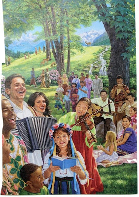
Some of those pictures were pretty darn good, at least from a technical standpoint.

It’s nice to see that there are accordions in heaven. But all those happy, smiling people start to get on my nerves, even though I’m a guy who paints utopias!

I thought of a quote from the artist Jean Giraud:

"One is never made only of light or darkness, but both. I believe I have always encouraged artists to express their duality, telling people who know how to show pain, horror and anger in their work to also look for ways of expressing their other face, the angelic face, the face of joy; but also encouraging those who express their inner beauty to accept their other side, their dark side, and express their pain and anger.”

I agree with Mr. Giraud that each of us has to make an effort to develop the opposite side of our vision. My own creation of Dinotopia tends toward the rosy or whimsical side of life—though it does have its share of cheats and scoundrels.

There’s a darker side of me an artist that I have to give voice to once in a while. Back in 1990 I painted a monster for a science fiction paperback called “Total War.”
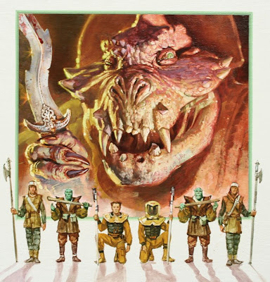
This is the sanitized version: the original version had a lot more blood dripping down the knife and the jaw. I thought I’d go all out. The art director sent it back and asked me to clean it up a bit.

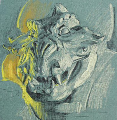
I sculpted a clay maquette first to really figure out the form, and lit it with separate colored lights. This tone paper sketch was the only form reference I used; I didn’t take photos of the maquette, but used this study instead.

This paperback cover is not a masterpiece. It’s as shallow as a lot of modern art that tries to do nothing more than shock. It’s as one-dimensional as the painting of smiling people with accordions.

In my heart I believe the greatest works of art weave light and dark elements inextricably together. This is the hallmark of the great works by Shakespeare, Beethoven, and Rembrandt. Sublimity is mixed with banality; joy with suffering; kindness with cruelty; beauty with ugliness. That is what our life is like. We are composed of light and clay.

Thanks to Pharyngula for spotlighting the post on the unexpected visitors.

Wednesday, May 28, 2008

Art By Committee: Stone’s Bark

Wednesday is the day for a game called "Art By Committee,” where you illustrate an actual excerpt from a science fiction manuscript.

This week’s quote was: “Stone emitted a kind of bark – ha! – and showed his teeth again.”

This one was open to interpretation: is Stone a dog, a rock, or a man? Everyone cleverly illustrated the quote, but no one visualized it in the same way.

Be sure to scroll down to the end of the post for next week’s challenge.

Jen Zeller Andrew Wales

Raluca Braming-Hansen

Arthur Keegan

Heather Dawson

Todd
Isaac (9 years old)


...and the one from the original sketchbook. Now, here’s the challenge for next Wednesday. Hopefully your imagination will take over for the poor author, who apparently ran out of gas.
Have fun! Please scale your JPG to around 700 pixels across. Title it with your name, send it to: jgurneyart(at)yahoo.com, subject line ABC, and let me know in your email if you want me to link to your blog or website. Please have your entries in by next Tuesday at noon.

Tuesday, May 27, 2008

Flagging the Head

“Flagging the head” refers to placing a white shape behind the head of the most important character in a figural composition. It’s a sure-fire way to place the viewer’s attention exactly where you want it, especially when you’re working against an impossibly busy background.

In this illustration by Maurice Bower*, the woman’s head gains importance because of its position against the light of the bright window of the crowded pharmacist’s store.

In “Norman Rockwell Visits a Country Doctor,” 1947, the doctor’s face would be lost in the clutter of his desk were it not for the brightly illuminated bunch of papers behind him.

When I painted this holographic workstation, I was worried the hero would be lost in all the detail, so I flagged his head with a slanting white table. You can see the Dean Cornwell and John Berkey influences on this paperback cover from the mid 1980s.
-----------
*The Maurice Bower painting is lot 29 of the upcoming June 7 auction at Illustration House in New York, link.

Monday, May 26, 2008

Unexpected Visitors

When the doorbell rang yesterday, Jeanette leaned into the studio and said, “Jim, would you get it?”

A silver BMW with spoke wheels had parked in the driveway. Two men with blue shirts were standing on the front porch.

I reached for my sketch pouch and stepped outside. The younger man said, “Are you concerned about the future?”

“Sure,” I said. I opened up some folding chairs and invited them to sit down. I asked the younger man if he would be willing to sit for a sketch, and he agreed. He opened his Bible and read the stories of Adam, Noah, Job, and Lazarus.

“According to Jehovah,” he said, “God is bringing this system to an end, and suffering will come to mankind.”

The older man followed along with his index finger in his own Bible. He glanced up from time to time to watch me draw. I was using a 4B graphite pencil. After I sharpened it a couple of times the pencil became almost too short to hold. The older man said, “I was wondering when you were going to get a new pencil.”

The younger man said that no one had ever sketched his portrait before. He brought out a camera and asked to take a picture of the sketch and of us together.

The older man reached into a leather case and handed me a book entitled "WHAT DOES THE BIBLE Really TEACH?" and "SHOULD YOU FEAR THE FUTURE?" They said they would be back again. I’ll have my watercolor kit ready.

Sunday, May 25, 2008

Color Zones of the Face

The complexion of a light-skinned face is divided into three zones. The forehead is a whitish or golden color. From the forehead to the bottom of the nose is reddish. The zone from the nose to the chin tends toward a bluish, greenish, or grayish color.


In real life, these zones can be extremely subtle, almost imperceptible. They are more pronounced in men.

This is an unretouched reproduction of Gilbert Stuart’s portrait of Washington.

Although this chin is covered by a white beard, this portrait of the surgeon Nicolay Pirogov by Ilya Repin shows the first two bands clearly enough.

Women and children don’t have the five-o-clock shadow, but they can be a bit greenish around the lips, and many artists play this up to bring out the complementary lip color. Below, a detail of a portrait by Sargent.

There’s reason behind this. The central zone of the face has more capillaries carrying oxygenated blood near the surface. The forehead, by contrast, is much more free of muscles and red blood cells. And the chin, especially on a man with a black beard, is bluish from the microscopic hairs. Around the lips are relatively more veins carrying blue deoxygenated blood.

Like all general rules, there are plenty of exceptions. But it’s good thing to keep in mind next time you’re painting a head.

Saturday, May 24, 2008

Paint Brand Poll Results

Thanks to all 146 of you who joined the oil paint brand poll. Here are the results.

The first number is the number of you who said you use that brand. After each brand is the list price/current sale price for a 37-40 ml tube of ultramarine blue from one of the online art suppliers.

102 Winsor & Newton 13.90/6.95
45 Gamblin 10.95/8.21
37 Old Holland 13.29/10.63
30 Grumbacher 9.25/6.11
22 Holbein 11.95/7.93
19 Williamsburg 12.95/9.34

5-10 Art Spectrum, Blockx, Cennini, Daler-Rowney, LeFranc&Bourgeois, Permalba, Schmicke, Sennelier, and Vasari.

All other brands received fewer than 5 votes. In the comments, feel free to say what you love or hate about any of the kinds of oil paint.

And if you have a second, please add your vote to the art medium poll at left.

Friday, May 23, 2008

The View from Seat 23F

If Frederic Church booked a seat on a modern airline, what would he think of the view out the window? How would he respond to a landscape of pure clouds with no terrestrial foreground?

Early in his career Church painted this scene based on the sunrise view from the eastern scarp of the Catskill Mountains. It has the feeling of being detached from the ground, but there are still vestiges of rocks and trees beneath our feet.

A couple months ago I sat atop Storm King, a mountain overlooking the Hudson River near the cities of Newburgh and Beacon. As I sketched, I found myself unconsciously wanting to invent a repoussoir element in the foreground to give the viewer something to hang onto.

I was thinking of Caspar David Friedrich’s famous painting of the wanderer above the sea of clouds. He puts us on the dizzy heights with the world below almost swallowed up in vapors.

One contemporary artist, Hillary Brace, draws cloudscapes entirely devoid of solid ground.

I think Church would have loved the challenge to paint a pure sea of clouds. After all, his most famous painting, Niagara, dispensed with a solidity and security altogether.

Landscape painting at its best uses visible matter to convey invisible realms of space, air, depth and silence.

-------
Thanks, Chris. Hillary Brace, link. Jing Hao, link.

Thursday, May 22, 2008

Elm Tree

A mature American Elm tree is a majestic—and increasingly rare—sight in the northeastern U.S.A. Only about one in 100,000 is resistant to Dutch elm disease, which killed off a hundred million trees starting in the 1930s.

When I saw this one in the neighboring town, I wanted to paint its portrait. It was a hazy day, so the distant trees were pale, and the sky was a cool, milky color.

The study is in oil, 8x10 inches. The branches arch outward from the central trunk, drooping downward at the outer edges. A poison ivy vine scales the trunk. Deer have browsed the bottom four feet of the ivy. A golfer stands in the shadow practicing her golf swing.

Mary Eleanor Wilkins Freeman, in her book Six Trees, wrote about a similar elm:
There was not in the whole countryside another tree which could compare with him. He was matchless. Never a stranger passed the elm but stopped, and stared, and said or thought something about it. Even dull rustics looked, and had a momentary lapse from vacuity. The tree was compelling. He insisted upon recognition of his beauty and grace. Let one try to pass him unheeding and sunken in contemplation of his own little affairs, and lo! He would force himself out of the landscape, not only upon the eyes, but the very soul.
-------
Wikipedia on the American Elm, link.
Website dedicated to saving the American Elm, link.
USA Today article about the return and resurgence, link.

Wednesday, May 21, 2008

Art By Committee: Chukumbu

Wednesday is the day to cut loose a little with a sketch game called "Art By Committee,” where you illustrate an actual excerpt from a science fiction manuscript.
Everyone brought out their sense of drama and mystery, as well as wit. Thanks, gang! Be sure to scroll down to the end of the post for next week’s challenge.


Eli K.

And finally the drawing in the original “Art By Committee” sketchbook, which I’m afraid is a little gruesome. It must have been something in the coffee.

Here’s the challenge for next Wednesday: "Stone emitted a kind of bark -- ha! -- and showed his teeth again."Have fun! Please scale your JPG to around 700 pixels across. Title it with your name, email it to: jgurneyart(at)yahoo.com, subject line ABC, and let me know if you want me to link to your blog or website. Please have your entries in by next Tuesday at noon.

Previous Art By Committees, Link.

Tuesday, May 20, 2008

Repoussoir

The French word “repoussoir” refers to an object placed in the foreground of a composition that enhances the illusion of distance with other objects. The word conveys the sense of “pushing,” as if the foreground object helps to push back the far spaces.

In this painting by the Hudson River School painter Jasper Cropsey, the trees at the margins of the composition act as a framing device to send back the mountains and the setting sun.

Frederick Lord Leighton painted this processional scene, which has a strong sense of motion from the right to the left.

The figure leaning on the wall at the far right gives the feeling of an actor standing at the proscenium of a stage. He pushes back the plane of the other figures and anchors the right side of the composition.

According to Odile Chilton, visiting professor of French at Bard College, “repoussoir” also conveys the sense of “strong or vigorous color or tone to make the clear and luminous parts of a painting more visible.”


This painting of the Grand Canyon by Thomas Moran uses strong tonal contrasts in the foreground rocky ledge, which helps launch the viewer into the colorful spaces in the distance.

Thanks, Chris, ARC, and Dr. Chilton

Tomorrow: Art By Committee