Saturday, May 31, 2014

Color temperature in the shadow out-of-doors

The Bath, (Baño or Jávea), 1905 by  Joaquín Sorolla y Bastida (Spanish, 1863–1923)
This ebullient painting by Joaquín Sorolla is an example of the common principle: In the shadow, up-facing planes are cool and down-facing planes are warm.

The shift from warm to cool occurs both in the figure in the foreground and in the rocks in the background. The reason for the shift in color temperature is that the up-facing planes pick up more of the sky color and the down-facing planes receive more of the ground color. The actual color mixture is a combination of the surface color of the skin and the color of the light striking it.


One last thing to note is that the warm/cool shifts in the shadow planes can occur at nearly equal value, and it's often very effective to paint them that way.
------
Oil on canvas; 35 1/2 x 50 1/2 in. (90.2 x 128.3 cm)
The painting is in the Metropolitan Museum collection, though not on view now.
High res file available from Wikimedia Commons
Sorolla book: Sorolla: The Masterworks
My book on Amazon: Color and Light: A Guide for the Realist Painter
My book on color, signed for you

Friday, May 30, 2014

Trost Richards pencil landscapes

The practice of drawing landscapes in graphite pencil was probably more common in the 19th century than it is now, as most people nowadays think of plein-air work in terms of full-on painting.

 William Trost Richards painted in oil, watercolor, and gouache, but he also did many graphite drawings, often in very small pocket-sized books. Trying to represent such things as complex tree silhouettes faithfully with pencil is good practice for painting them later.

Here he sorts out the light and dark puzzle of the plank railing on a log bridge.

The Metropolitan Museum has a large sampling of William Trost Richards' pencil, watercolor, and oil landscapes in their collection, which is available online.

Here's a well-illustrated survey of his work, based on a recent museum show: William Trost Richards: True To Nature: Drawings, Watercolors and Oil Sketches

Thursday, May 29, 2014

Courtroom Sketch Artist

Courtroom Sketch Artist on Vimeo.
The New York Times produced this video profile of Texas courtroom sketch artist Gary Myrick.

The survival of the profession depends on the prohibition of cameras in the courtroom. As cameras get less obtrusive, those prohibitions are eroding.

Defense witness in the Cullen Davis Trial, 1977. Art by Gary Myrick
This woman was part of the defense in a trial. Myrick got in trouble for referring to her as the "1957 Cadillac."

With the gradual disappearance of courtroom art, something else is lost. "Illustration is storytelling," Myrick says. "The difference between a camera in the courtroom and an artist might be the difference between just a cold, dry factual transcript, as opposed to a novel."
(Direct link to video) via BoingBoing
Previously on GurneyJourney: Jury Duty

Wednesday, May 28, 2014

Reality, Enhanced by Animation


Storyboard artist Marty Cooper, also known as Hombre McSteez, had a viral hit on his hands this week with his compilation of short videos that he made for Instagram. In each one, he holds up drawings made on transparent cels in front of a background environment. The apparent interaction makes them hilarious.

Marty works for ReelFX and is a member of the ShrunkenHeadman Club of San Jose State University.

Thanks to everyone who recommended this.
(Direct link to video)

Tamaki and Wyeth: New Books

 
A new graphic novel by the cousin team Jillian Tamaki and Marika Tamaki, This One Summer follows the friendship of two girls, Rosie and Windy during a summer they spend together at a lake house.

Against the backdrop of family dramas and neighborhood crises, they go swimming, watch movies, dance, eat, and talk, trying to make sense the adult world from their perspective of preadolescence.

Both the writing and the drawing are natural and well-observed, and the close pairing of word and pictures leads to moments of real poetry.


Between 1964 and 2007, Life magazine editor Richard Meryman visited Andrew Wyeth and let him talk —with the tape recorder running. The resulting 400 hours of material were boiled down to a 126 page book called Andrew Wyeth: A Spoken Self-Portrait

Wyeth's musings, together with a peppering of quotes from family, friends, and critics, gives a powerful insight into Wyeth's unconventional thinking. There are quite a few photos, paintings, and sketches included in the book, and the back of the book has a portfolio of photos of Wyeth's spare studio.

By way of example, here's what Wyeth says about painting in watercolor: "You've got to be a perfect ass to paint the way I do. My best watercolors are when I lose all control—gobs of paint and scratches and spit and maybe mud spattered against the sky. You start to clean it up and there's no life — just smooth things maybe done in the studio with a hairdryer to blow your washes."

"I'd rather miss sometimes and hit strong other times than be an in-between person. If I lose this wildness, I'd be just a perfectionist. I certainly don't want to die without trying every means possible to get what I want. It doesn't matter if you stand on your head and use your feet if you get what you want. I did as many as six watercolors a day and might get one or two that came off."

At Amazon:
This One Summer - Jillian Tamaki and Mariko Tamaki


Tuesday, May 27, 2014

Motion Illusions


Here's a false motion illusion, caused by the cognitive effects of interacting color boundaries.


It looks to me like the tentacles of a colorful creature. The tentacle you're not looking at is the one that slithers forward. Or you might see it as the feet of an Oopsidoofus as he slides his feet into his knitted socks.

The effect usually happens best in the periphery of the retina.

In this peripheral drift illusion, the wheels seem to rotate when the eye scans text.

Thanks, Christopher!

Monday, May 26, 2014

The Battle of Hampton Roads


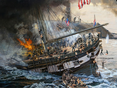
In recognition of this day for remembering people who died in war, I offer my painting "Sinking of the Cumberland" from the American Civil War. 

I painted the image for National Geographic after reading many first hand accounts of the Battle of Hampton Roads, studying ship plans, and sketching artifacts remaining from the event. 


The original painting currently hangs at the Mariners' Museum in Newport News, Virginia, where it's on long-term loan.

Read about the making of the painting at the previous post Sinking of the Cumberland

Sunday, May 25, 2014

The 3D Aspect of Hand-Drawn Animation

People often distinguish hand-drawn animation from CG animation by referring to them as "2D" and "3D." This distinction leads naturally to the thought that hand-drawn animation is primarily concerned with shapes, silhouettes, and other flat graphic qualities.

But really during the Golden Age of Animation in the 1930s and '40s, animators had to be very aware of 3D forms. When Disney animator T. Hee developed the caricatures for the short "Mother Goose Goes Hollywood," he thought of them in terms of dimensional volumes, based on spheroids, and seen from different angles.


The mouth on the Katherine Hepburn model took a lot of special care because it's not just a flat downward crescent; it also goes back into the head, and he notes how far back it should go as seen in profile. 


Here's the Silly Symphony from 1938, where you can see the caricatures in action. Look for Katherine Hepburn, The Marx Brothers, W. C. Fields, Charles Laughton, Spencer Tracy, Laurel and Hardy, Edward G. Robinson, Clark Gable, Fred Astaire, Greta Garbo, Fats Waller and Cab Calloway. Because of the racial and ethnic stereotypes, the film isn't often seen these days.

The model sheets are courtesy Bill Peckman and Michael Sporn.
Mother Goose Goes to Hollywood (1938) Thanks, Christopher

Saturday, May 24, 2014

Steps for "Strategy Session"

Here's a small spot illustration called "Strategy Session" that I did for the back cover of a science fiction paperback in the late 1980s, showing a group of interplanetary military types planning their next move.

Here's the first concept sketch from imagination, drawn with a pen and markers. I did four or five of these sketches, and the art director and I chose this one with a red dot.


The next step was to work out each of the creatures. I did this charcoal study of "Hammerhead" while wearing an old costume and looking in the mirror. Yeah, that's me posing. That's pretty much how I look when I try to pull an all-nighter.

Here's another study on tone paper. I put on the costume, took the pose, and used two mirrors so that I could see myself in side view. The little planar study helped me focus on the big simple forms of the head.

I like doing studies instead of taking photo reference not because I want to be low-tech and classical, but because this method is more practical. It's faster than taking a photo—or at least it was faster when you had to get photos processed overnight. But more importantly, it gets me thinking about artistic choices right away, and I'm not swayed by incidental details.


Once I had all the studies, I worked them into a line drawing, which I transferred down to the panel in preparation for the oil painting, which is about 6 x 12 inches.
------
The painting appeared on the back cover of The Fleet #4: Sworn Allies by David Drake

Friday, May 23, 2014

Veduta

View of New Market Square, Dresden, Bernardo Bellotto, 1750
A veduta (Italian for "view) is a classic panorama of a famous motif. Such view paintings acted as important records in an age before photography. People returning from the Grand Tour might want to buy a veduta of the Roman Forum or Venice.

Vedute paintings also served as tokens of civic pride to be displayed by the wealthy class, who also bought them in the form of engravings. Here's a painting from 1747 of "The River Thames from Richmond House" by Canaletto. Another example is the View of Delft by Vermeer.

A subcategory of this genre was called the veduta esatta – a view that's meant to be exact or accurate.

Another subcategory is the veduta ideata or capriccio, an idealized view with liberties taken from the actual scene. In this capriccio of Rome by Giovanni Paolo Panini from 1735, famous monuments have been shuffled around to fit the main attractions of Rome onto a single canvas.

Thursday, May 22, 2014

Did Fitz Hugh Lane use a camera lucida?


Karen Quinn, a curator at the Museum of Fine Arts in Boston, suggests the possibility that Fitz Hugh Lane used a camera lucida in recording the topography of one of his seascape paintings. (Direct link to video)

The hypothesis hinges on the presumed mechanical appearance of the drawing, and its alignment with the final painting (seen here in a superimposed image). In fact the images don't line up that closely, and the drawing has more of a searching than a tracing look to me.

This example doesn't seem like a really solid case to me, but I wouldn't be surprised to see other examples that make a surer demonstration. (Video link)

X-Ray Reveals Archaeopteryx Details


Scientists demonstrate a powerful new X-ray system that visualizes details beneath the surface in an Archaeopteryx fossil. (Direct link to article)
(Thanks, Joanne)

Wednesday, May 21, 2014

Tashlin's SCOT Art

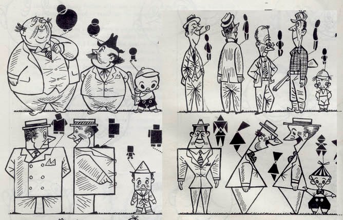
Frank Tashlin was an animator and director, noted for his early Warner Brother cartoons. He wrote a book in 1952 called "How to Create Cartoons" where he wrote about his "SCOT Art" method. 

SCOT stands for square, circle, oval, and triangle. Tashlin gives many examples of cartoons made with those basic shapes.

Some figures are made of a combination of these shapes. He also includes the rectangle, which can be seen as an extension of the square. 

The shape analysis applies even when the figure is in extreme action.

Tashlin's drawings have their own wacky energy, as did the cartoons he directed, which were known for cinematic-style camera angles. 


His version of Porky is very circle-based in Looney Tunes like Porky's Railroad
------
View pages in "How to Create Cartoons" on Drawger

Tuesday, May 20, 2014

Met Puts High-Res Files Online


 The Metropolitan Museum of Art in New York has been offering high res digital image files for some time, but now they're making additional high-res files available for free download. This link takes you to the browse page.
William Trost Richards • Metropolitan Museum
A museum spokesman says: "Through this new, open-access policy, we join a growing number of museums that provide free access to images of art in the public domain. I am delighted that digital technology can open the doors to this trove of images from our encyclopedic collection."

With these files you can get a close up look at the technique and textures. Though the quality of the scans varies from piece to piece (and some pieces have multiple files), this represents an enlightened step for a major institution, and I hope other museums follow suit to put public domain images online.

Via Kottke.org, thanks Eric

Monday, May 19, 2014

Painting a Triumph Spitfire

Yesterday the parking lot at the shopping mall was turned into a race track, and—you guessed it—I brought along my watercolor book.

....and my video camera. (video link)

Jeanette and I set up our sketching chairs next to the modified Triumph, owned by Mark Vandecarr of M&M Automotive, who has been fixing our old cars for 30 years. 

Mark said "Put a helmet on, and I'll take you for a ride." It was a thrilling experience--I've never been in a car that maneuvered so fast. Despite lugging around my dead weight, he set a lap record. 

Triumph Spitfire, by James Gurney, watercolor and gouache, 5 x 8 inches.
Here's the sequence, which applies to any subject, really:
1. Line drawing in water-soluble colored pencils, carefully measuring units of distance.
2. Large general areas painted with transparent watercolor using a half inch flat brush.
3. Gouache for the details of the roll bars and decals.
4. In all, the painting took about an hour and a half. The drivers had just left for lunch when I started, so I had a feeling the car would only stay parked for that long.
Using a brown pencil on its side gives a quick ground texture. This technique is well suited to a subject like this because it's quite forgiving, and well suited to small detail work.

Sunday, May 18, 2014

Yvon's Academic Drawing Manual

Many of you are familiar with the drawing course by Charles Bargue and Jean-Léon Gérôme. Painter and teacher Darren Rousar has procured another drawing manual from the period called "Methode de Dessin" by Adolphe Yvon.

This was the method used by John Singer Sargent when he studied in Paris. According to Rousar, copies of this manual are extremely rare, and he has generously offered to put his copy online for free, but first he's inviting French/English translators to help him render it into English.

Here's a preview of one of Yvon's plates. I'm just guessing from the plate, but it seems to be a slightly different process from Bargue. He still uses the straight lines, but rather than bounding the outside of the form in an envelope or polygonal shape, he seems to find the most general big line going through the contour. The vertical line appears to be a record of measurements and alignments, subdivided into smaller measurements, probably made with the plumb line.

Here's one of Bargue's plates for comparison, with the outside bounding envelope going from the forehead to the tip of the nose and the nose to the chin, with the plumb-line measurements marked on a line drawn inside the form.

Sargent said that the plumb line (basically a weight dangling at the end of a string) was essential:
"When drawing from the model, never be without the plumb line in the left hand. Everyone has a bias, either to the right hand or the left of the vertical. The use of the plumb line rectifies this error and develops a keen appreciation of the vertical."

If you'd like to participate in translating some of first pages (or just read them in French), here's a link to Darren Rousar's studio blog. 
----
Charles Bargue's method from Amazon