


Sunday, January 31, 2016
We come in all shapes
Saturday, January 30, 2016
Esopus Island
 |
| Esopus Island, gouache over blue underpainting, 4 x 4 inches. |
I have kayaked out there in the spring to see the rare wildflowers with names like Indian Pipes and Dutchman's Breeches. They're hard to find on the mainland because they get eaten by the deer. It's also a nesting colony for Canada geese, so you have to be careful in the spring, or they will attack you if you get anywhere near their nests.

"With little more than a tent, a leaky sailing canoe, and some red paint, when he was not meditating cross-legged for hours at a time on the beach, he spent his time smearing DO WHAT THOU WILT and EVERY MAN AND EVERY WOMAN IS A STAR across the rocky cliffs facing the passing steamers. The local farmers kept him alive with gifts of eggs, milk, and sweet corn...."Read more about Crowley's sojourn: The Hermit of Esopus Island
Wikipedia on Aleister Crowley
(I'll continue the Harold Speed this next Friday -- I'm a little behind because of deadlines.)
Friday, January 29, 2016
Abstract Mickey in a Real World
Mickey and Minnie were three-foot-tall mice with circles for ears living in a human world.

As long as the animation style was abstract enough, the absurdity of that idea worked. But as Disney animation became more realistic, it became more and more untenable.
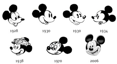
Toy designer and Mickey collector Mel Birnkrant puts it this way:
"Mickey disappeared because of Disney's push towards reality, which wrecked a lot of things in my opinion. As [veteran animator] Ward Kimball explained to me—and this is the inside story—all of Disney was steering a course towards reality. And it got to a point where the story men, as well, could no longer swallow the existence of a three foot mouse. They could believe in Donald Duck as he was just large enough to exist in the human world (think Three Caballeros). But Mickey no longer made sense to them."

("Bath Day," 1946) Link to YouTube
"Mickey and Minnie interacting with small kittens was a recurring theme in the early days, but there was no such thing as reality back then. All the characters were abstract."
Disney Studios has recently attempted to revive Mickey as a more abstract (and sarcastic) character in short films for the internet.
----
Previous Post: How Tall is Mickey? (With the weird live action clip of a monkey in a Mickey suit)
Deja View Blog: Fred Moore's Mickey Sketches
Mel Birnkrant's Cartoon Character Collection
All art ©Disney Studios

As long as the animation style was abstract enough, the absurdity of that idea worked. But as Disney animation became more realistic, it became more and more untenable.
Over the years, Mickey underwent a design evolution, including a major redesign by Fred Moore for Sorcerer's Apprentice. The effort to make him and Minnie more dimensional and emotionally complex came with a price, however, because they became less believable. There was always the problem of those abstract circular ears, which did bizarre things on head turns.
Audiences eventually lost interest in the character, despite efforts to make him the official mascot for the Disney Studios.
Toy designer and Mickey collector Mel Birnkrant puts it this way:
"Mickey disappeared because of Disney's push towards reality, which wrecked a lot of things in my opinion. As [veteran animator] Ward Kimball explained to me—and this is the inside story—all of Disney was steering a course towards reality. And it got to a point where the story men, as well, could no longer swallow the existence of a three foot mouse. They could believe in Donald Duck as he was just large enough to exist in the human world (think Three Caballeros). But Mickey no longer made sense to them."

"The absurdity of the situation is no better illustrated than in the post-Pinocchio cartoon when the kitten Figaro was developed to a new level of realism. There is a scene in which Minnie is giving Figaro a bath that is utterly surreal."
("Bath Day," 1946) Link to YouTube
"Mickey and Minnie interacting with small kittens was a recurring theme in the early days, but there was no such thing as reality back then. All the characters were abstract."
Disney Studios has recently attempted to revive Mickey as a more abstract (and sarcastic) character in short films for the internet.
----
Previous Post: How Tall is Mickey? (With the weird live action clip of a monkey in a Mickey suit)
Deja View Blog: Fred Moore's Mickey Sketches
Mel Birnkrant's Cartoon Character Collection
All art ©Disney Studios
Thursday, January 28, 2016
Quick Tip for Faraway Faces
I often want to sketch a person at a meeting, a lecture, or a concert, but I'm sitting too far away to see their features clearly. Here's a quick tip if you ever find yourself in that situation.

These sketches are each just about an inch high. I was merely trying to capture: 1) The head shape, 2) The shape and color of the hair (if any), and 3) the placement of the features. The features are just dots and dashes.
Analyzing faces with this kind of shorthand is good practice for your more closely studied portraits. When you're sitting close enough to see the eyelashes, it's easy to overlook the big relationships. And it's the big simple relationships that are the key to likeness and character.


Analyzing faces with this kind of shorthand is good practice for your more closely studied portraits. When you're sitting close enough to see the eyelashes, it's easy to overlook the big relationships. And it's the big simple relationships that are the key to likeness and character.
An inspiration for this kind of "dot-and-dash" thinking are the drawings of Winsor McCay, a pen draughtsman who developed an idiom for capturing realistic figures during the early era of comic drawing before the standard cartooning conventions had been developed.
-----
Wednesday, January 27, 2016
Using Gouache with Colored Pencils
One of the things I love about gouache is that you can draw directly on the matte surface of the paint with colored pencils. (Link to 30-second video teaser) This is especially helpful for subjects with a lot of linear detail.
 |
| Rutsen Swamp, gouache and colored pencils, 5x8 inches |
Rutsen Swamp is such a subject. It's a complex tangle of grasses, branches, twigs, and saplings, plus layers of transparency and reflections in the shallow water. Here's the painting in front of the subject.

This detail shows the range of textures.
Painting Sequence
I start by toning the paper in my sketchbook with gray watercolor (covering over another sketch that I screwed up). When that is totally dry, I sketch in the main trees with a dark colored pencil.
Then I lay down a foundation of the big tones in gouache. I paint freely across the smaller forms and concentrate on the big underlying gradations. The gouache is best suited to areas of flat tone or smooth transitions with precise value control, such as the cast shadows slanting across the dark reflections of the trees.

In the final stages, I render the smaller twigs, alternating between gouache and colored pencils, weaving light over dark and dark over light. I also look for areas that I can suggest with the grainy textures of light drybrushed gouache, or dark scumbled pencil.
It's impossible to capture every detail of the infinity of the scene in front of me, so I have to invent a strategy to suggest the textures. I find what works best is a mixture of precision and impetuous energy.
---
More resources
The swamp painting is part of my video download Gouache in the Wild, which is also available as a DVD.
Pencils: Caran d'Ache Supracolor II water-soluble colored pencils
Gouache (I've been using Holbein a lot lately)
Watercolor set in metal box (Schmincke)
Tuesday, January 26, 2016
Andrew Wyeth’s Techniques in 1942
 |
| Andrew Wyeth, The Coot Hunter, 1941 |
Watercolor technique
"He works on a medium rough watercolor paper which he has made up in blocks (22x30 in). He objects to stretched paper, says he believes it loses its capacity for brilliant effects. All his painting is done with three sable brushes, Nos. 5, 10 and 15. The never uses those broad flat brushes so many artists employ for large, covering washes.
 |
| Andrew Wyeth’s palette and the three brushes with which he paints all his watercolors. |
"In beginning a watercolor Wyeth very rapidly lays in the large masses in their approximate colors, but without detail definition. This may or may not have been preceded by a slight pencil indication.
 |
| Wyeth often makes rapid ink sketches like this, on the spot, and then does the watercolor in his studio. |
"Thus the paper is entirely covered in the first few moments, except for white areas which are untouched by the brush—Wyeth never uses white body color. Occasionally white, or near white, is obtained by a heavy stroke of the brush-handle in a still-wet wash.
"Working back into the wet areas he develops his picture, pulling definition out of the blurred color masses, working all over the picture while it is still moist.
"The technic of watercolor—that is, in the fluid method—presupposes rapid and skillful execution. Yet working within the limitations of its properties some artists proceed with a degree of deliberation. It is quite possible, technically,—and without sacrificing freshness—to work on a picture over a considerable period, even to come back to it the next day. Many artists spend at least two or three hours on a picture. Wyeth’s practice is to skim off the white heat of his emotion and compress it into a half hour of inspired brush work. He is the first to admit the presumption of this kind of attack, and is ready to confess that it fails more often than it succeeds.
 |
| Andrew Wyeth, Pennsylvania Landscape, egg tempera on board, 1942, 35x47 inches |
"Mindful of the dangers inherent in practiced facility with his watercolor brushes he has put them away in moth balls for a season and, during the past year, has been devoting himself to tempera painting, employing a technic that imposes strict disciplines.
"In his temperas Wyeth’s objective is to cover up his brush strokes and obtain a sense of freedom through pattern rather than technic. He paints these pictures with a single sable brush not over 3/4 of an inch long.
"These are done on Masonite upon which three coats of whiting mixed with casein glue are applied as a ground. The pulverized glue is heated, in water, in a double boiler. Wyeth sandpapers the final coat to a very smooth finish. The panel is made rigid by a framework attached to the back. He paints with dry colors mixed on his palette, as he works, with distilled water and egg yolk.
"His procedure is to make a monochrome underpainting in black ink. The colors, applied over this black and white, have a quality of weight and depth preferred to the result of direct painting in color. This is in accordance with the traditional method of old masters who used this medium.
"This turning from the freedom of watercolor to the exactions of tempera illustrates the intelligent purpose of a young artist in seeking strength and breadth as foundation for the work he hopes to do later on. Through his tempera paintings he is acquiring the habit of accuracy and is seeking an intimacy with nature which he feels he cannot attain with his watercolor brush alone. Thus fortified he believes his watercolors, though painted in a burst of enthusiasm, are more likely to be informed and interesting in every detail.
"‘Too often,’ he says, ‘a watercolor appeals solely by virtue of tricks and fortuitous beauties inherent in the medium itself. My aim is to make every part of the picture alive, interesting.’
"The casual observer, turning from Andrew Wyeth’s impulsive watercolors to his tempera paintings, executed in the spirit of old master craftsmanship, might well be puzzled. They appear in temperament as well as in technic like the work of two separate individuals. They are, in the sense that the well-rounded man is a different man at different times, as he takes devious directions to arrive at a goal that cannot be approached by a single paths. Only the artists himself can see the map whereon those divergent paths finally meet in the ground strategy of a single purpose.
"We shall watch for the meeting of those paths in the work of Andrew Wyeth."
——-
Excerpted from "Andrew Wyeth, One of America’s Youngest and Most Talented Painters," American Artist Magazine, 1942.
You can also get vintage copies of American Artist Magazine online.
Monday, January 25, 2016
Fantasy in the Big Muddy

Arnie Fenner, co-founder of the Spectrum Annual of Contemporary Fantastic Art did a nice writeup on Fantasy in The Wild and my other tutorials for Muddy Colors, the go-to blog for the art of imaginative realism.
Speaking of Spectrum, today is the deadline for submitting entries, so if you've been putting it off, there's still time before the clock strikes doom.
Sunday, January 24, 2016
Three Challenging Questions
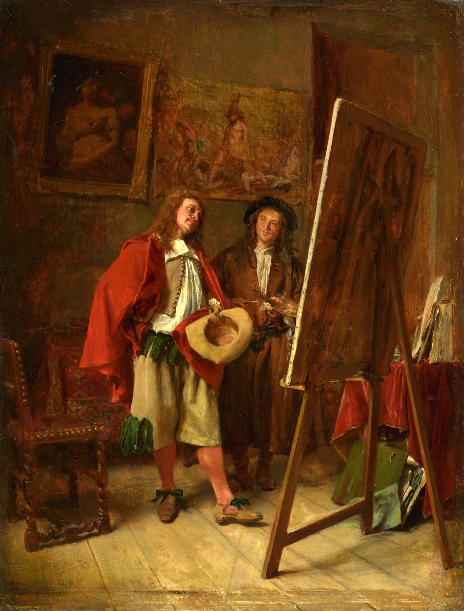 |
| Ernest Meissonier, Connoisseur and Artist |
How are you still not bored by painting the nature? Not trying to be unpolite, I'm just curious. You're already an amazing artist with nearly perfect understanding of the light. Why do you still paint from nature? Isn't it more interesting to paint from imagination when ur understanding of light/form is as good as yours? I really love your Dinotopia series and for me it seems more fun to paint it than from nature. I hope you will answer me, I'm really curious why do you still paint so much from nature. Cheers smile emoticon
James Gurney Hey, Andrzej, That's nice of you to say, but I'm a long way from a perfect understanding of anything. My first answer is to say that I really love both imagination and observation equally. One feeds inspiration to the other. When I'm painting an imaginary scene, I pretend that I'm really observing it, and when I paint something in front of me, I try to bring something of my inner life to the experience of seeing it.
Painting from nature is a lifelong quest in itself that demands every ounce of my concentration, focus, and skill. I feel a strong desire to capture my view of the beautiful ordinariness of the world around me. All through my life, I've done paintings from observation and imagination side by side.
For the next issue of International Artist I've just written an article called "On-the-Spot Surrealism" which explores ways to morph the two together. And I guess that's the second answer. I'm becoming more and more interested in exploring the borderline between the real and imaginary worlds, which may not be as separate as you suppose.
Zedasilva3 says:
I really admire traditional painting, I really do. I have a lot of respect for it. But being honest, is it worth it when digital painting have reached such a tremendous quality standard and also take a lot less effort? And may it be clear that I'm not criticizing here. The guy is a true master of art, but I ask myself if [it] is fit for the 21st century.
Thanks for the compliment. It's hard for me to compare digital painting to physical painting, since I've never really done much with digital art-making. For the kind of work I do, I find the traditional tools to be the most productive, efficient, and satisfying. Part of the reason is that the lack of an "undo" button forces me to focus and commit and take risks, and I like that.
And I love having my work embodied in a physical object that I can hold in my hands or exhibit in a museum. Making a physical painting is a very basic thing for me, like chewing food with my teeth instead of getting it in an IV drip. For outdoor painting, physical tools have clear advantages of being visible in very bright light, portable, and workable without electricity.
Of course I respect those who work with digital tools for whatever reason, and I do use digital tools for graphic design, photography, video capture, and editing. We all make our peace with computers in one form or another, and there's no ideal mix of tools that works perfectly for everyone.
What we're seeing as we get farther into the 21st century is not more and more digital, but more interesting ways of combining handmade and digital to create new expressions that we haven't seen before. We're seeing that in movies, animation, crafts, graphics, and everything.
Karen asks:
You mentioned something in passing in one of your postings (I'm sorry, I can't recall which) and repeated it during an interview for Savvy Painter. You said, to paraphrase, that artists should study dead artists, not current artists. As a self-directed painter, I very consciously work on improving my craft by taking workshops and classes. I follow a number of inspiring painters online at Facebook, my primary source. I respect your opinion and ideas, so when you made this statement, I became worried that I may be limiting my study habits or studying incorrectly, and may be missing out on more artists. What artists should we be looking at?
Hi, Karen,
Good question. There's nothing wrong with looking at the work of living artists. The main reason I said that in the interview is because I find if I look too much at the work of any single artist, I might end up emulating them too much. The best I could ever hope to achieve is a second-best to their style. Looking at diverse artists from past eras and cultures makes it more likely that I'll develop my own original voice.
Another reason to study dead artists is that the best work has already been pre-sifted. The best stuff has a way of rising to the top, and you can look at the best of the best from different eras. Looking through the current crop of art, one has to be more selective. There's great work going on right now, don't get me wrong, and I admire the work of many of my colleagues greatly.
As to which artists? That's totally for you to decide.
All that said, it's best to put most of your time into studying nature directly. I have this strange feeling when I'm copying an artists work that if they were standing there they would be saying: "Don't copy my work. Go outside and paint from the real world!" In fact most of your time should be spent cultivating patience and focus in the face of nature. Ultimately, that's the source of it all.
Saturday, January 23, 2016
Léon Gimpel's WWI Kid Photos

In 1915, photographer Léon Gimpel befriended a group of kids playing make-believe war games on the streets of Paris, and had them stage tableaus for his new-fangled autochrome camera.
---
Read more in The Guardian
Friday, January 22, 2016
Harold Speed on Practical Color, part 2
 Today we'll take a look at Chapter 8: "Colour: Practical" from Harold Speed's 1924 art instruction book Oil Painting Techniques and Materials
I'll present Speed's main points in boldface type either verbatim or paraphrased, followed by comments of my own. If you want to add a comment, please use the numbered points to refer to the relevant section of the chapter.
We're continuing with the second half of this chapter, which starts on page 125.
1. Harold Speed's Color Chart
In my copy of the book, he doesn't show a visual of the chart he's describing, and I can't show you either because I haven't made one yet. If one of you has made one, please link me to it, and maybe I can use yours as an illustration.
Basically, you take a 20 x 24 inch white canvas and divide it into a grid of twenty-four 4-inch squares, five across the top and six squares down. The chart is to experiment with different qualities of oil colors when applied in different ways. As Loomis said, "you will have a diagram that should help you to realise the different qualities that can be got out of the same colours differently put on canvas."
The top line across is painted in red, second line purple, third line blue, fourth line green, fifth line yellow, and the sixth line is orange.

I won't further reiterate his instructions, but one piece of it that jumped out was the idea of putting a strong colored edge around an area of color. This was an old trick used by mapmakers, who would use four different colors to distinguish different counties or states, and then surround the outer edge of each area with that same color in a higher-chroma form.

Andrew Loomis, in his book, Creative Illustration , illustrates the same rule that Speed is talking about — the idea that you can boost the impression of color by intensifying the chroma at the shadow edge. "Adding a coloured edge to a mass," Speed says, "while not disturbing its purity of tone, does add colour vitality that is always apt to be lacking without it." Speed later points out that the edge where the subject meets the background is also important.
Here are some other points that jumped out at me:
2. The difficulty with oil paint is avoiding dullness or muddiness.
You have to work to get variation of value, chroma, and hue.
3. "Colours seem to dry very dull and lifeless when painted on a ground of similar colour."
It's often a good idea to tone the board or prepare the surface with a color that is complementary to the overall color of the finished painting.
4. "It is a good thing when a part has to be repainted, to rub a thin film of white over it."
And it also helps to rub out (if possible) an area that needs to be repainted.
5. Look for the main color accent when planning a color scheme.
Build all the other colors around it to support it. "Make sure your purest notes are clean."

6. "The fewer strokes of the brush you do your work with, the fresher the painting."
If you have a habitual way of repetitively stroking the painting: 'dink....dink....dink....dink...' or 'smoosh...smoosh...smoosh...' your work might be suffering from this lack of vitality. You might want to try painting a picture with 100 touches of the brush. Or practice calligraphy, where orchestration of strokes is the name of the game. Attracting the attention of your viewer to your strokes is not the purpose of this, though. It's more to give the form more force and vitality, to convey the larger story or emotion of the piece.
7. "Look for colour in your shadows."
Don't just peer fixedly into one part of the shadow, he says, but rather look at how the shadow relates to the overall.
 |
| Joseph Paul Pettit (source) |
8. "Don't bother about the greys, the greys will come."
The grays of your painting are a natural outcome of blending and mixing and merging the brighter colors of the design. The "Pettit" he refers to is Joseph Paul Pettit (1812-1882), a British landscape painter.
9. "The feeling of colour will have no opportunity of development during your form and tone studies."
Speed puts color study in a different category from the exacting sort of work in form and tone. Although I believe there is a practical science to color, and that it's not all subjectivity, I believe it does require a different mindset than the foundation of tone and form. That mindset seems to me more emotional and intuitive and not always justifiable to reason.
 Next week—Chapter 9, "Painting from the Life"
-----
In its original edition, the book is called "The Science and Practice of Oil Painting ." Unfortunately it's not available in a free edition, but there's an inexpensive print edition that Dover publishes under a different title "Oil Painting Techniques and Materials
 (with a Sargent cover)," and there's also a Kindle edition.
Get my book "Color and Light" signed from my website or from Amazon .
.
I also recommend Creative Illustration by Andrew Loomis.
----Get my book "Color and Light" signed from my website or from Amazon
I also recommend Creative Illustration
GurneyJourney YouTube channel
My Public Facebook page
GurneyJourney on Pinterest
JamesGurney Art on Instagram
@GurneyJourney on Twitter
Thursday, January 21, 2016
Brad Teare reviews "Fantasy in the Wild"

Brad Teare of the Thick Paint blog reviews "Fantasy in the Wild":
"Gurney uses a brilliant method of laying down color and then restating his drawing by drawing over the dried paint in water-soluble colored pencils. This method inspired me to find a means to restate linear elements in my abstracts–possibly by making some kind of acrylic/chalk drawing tool or using large pastels and then fixing the strokes with acrylic spray. Another great idea was his viewing grid to transfer images in the field. Watching Gurney use models and a wide array of creative solutions was valuable inspiration to surmount whatever obstacles I might encounter either in the field or studio." read the rest....
-----
Irish Fiddler Dylan Foley
 |
| Dylan Foley, gouache, 5x8 inches. Actually it's 2016! |
The concert took place in a community center where it was totally cool to bring out the paints. The only problem was that there was very little light, so I was guessing on the colors.
You can hear a sample of Dylan and Dan's recent album Irish Music From the Hudson Valley .
.
Check out more of my gouache paintings on Pinterest or follow my daily offerings on Instagram, which are often different from the images here on the blog.
Wednesday, January 20, 2016
Non Finito
Artists have left works unfinished inadvertently because time, the weather, or death called them away. Such partially completed works often provide insights as to how they were executed.
The non finito (literally "not finished") style is different, because the artist deliberately leaves parts of the piece uncompleted.
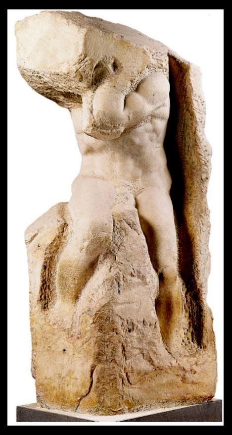 Michelangelo (left) and Donatello are also notable for their non finito sculptures, where the figure sometimes seems to be contending against its imprisonment in stone.
Online academic essays: Facilità and non finito in Vasari’s Lives. Carlos Montes Serrano
The Process of Artistic Creation in Terms of the Non-finito
GurneyJourney on sprezzatura
 |
| Danäid, 1889, Auguste Rodin (source) |
Rodin's Danaïd, above, is a mythological woman who despairs from her punishment for killing her husband. Her hair merges with the water that she has spilled on the ground, and the curve of her back almost seems like a part of the landscape, merged with the rough marble.
Michelangelo (left) and Donatello are also notable for their non finito sculptures, where the figure sometimes seems to be contending against its imprisonment in stone.
The non finito style often conveys a particular attitude of the artist toward the piece, suggesting ease, effortlessness, or informality. It has the effect of sprezzatura, which might be translated as studied carelessness.
It can also express a mystical sense of transformation reminiscent Lao Tzu's admonition to "return to the state of the uncarved block."
Studied non-completion is a common device among contemporary realist sculptors and painters, with many academic ateliers exemplifying a style where the rendering is deliberately left unfinished.
The Metropolitan Museum will be hosting an exhibition called Unfinished: Thoughts Left Visible March 18–September 4, 2016 with 197 works at the Met Breuer.
The Process of Artistic Creation in Terms of the Non-finito
GurneyJourney on sprezzatura
Previous posts on unintentionally unfinished works:
Tuesday, January 19, 2016
Concert Sketching: Dealing with Movement
Here's another sneak peek at the current issue of International Artist, where I answer your questions about concert sketching.

Gustavo Torqueto asks: “How do you draw someone that is in constant movement?”
The amount that musicians move around varies a lot, depending on the style of the performer and the kind of instrument. A few are reliably rock-steady—Irish flutists, for example, especially if they are playing into a microphone. They tend not to budge, so you can settle into a careful drawing.
It’s a good idea to watch any performer for the first few minutes to observe the range of poses they’re likely to take, and to let them settle in. If the subject is going to move a lot, such as this symphonic conductor, I start a series of smaller sketches, each one representing a keyframe or characteristic pose that they cycle back into. I lock a pose in my short term memory by snapping my eyes shut and studying the afterimage.
-----
International Artist magazine issue 107
Monday, January 18, 2016
Plein-Air Painting is Illegal in St. Augustine
Painting outdoors in the downtown areas of Saint Augustine, Florida is a criminal offense and can result in a six month jail term and a fine of up to $500.00. The law regards plein-air painting as a form of performing, which is banned. Similar bans have been enacted in Winter Park, FL and Barcelona, Spain.

I asked Roger Bansemer, an outdoor painter who lives in Saint Augustine, for his views on this law. Roger and his wife Sarah host a nationwide show "Painting and Travel with Roger and Sarah Bansemer" on PBS (Public Broadcasting Service).

Gurney: What brought about the ban?
Bansemer: Shop owners complained because artists were taking up space in front of their businesses, but the bigger problem was that artists felt they had the "right" to set up shop on the street or park and commercially sell their paintings. So the artists in many respects were to blame for what has happened. When artists were allowed to sell their paintings, others felt they had the right to do the same so people began selling sun glasses and so on. It became a problem especially to those shop owners who pay high rents to have space usurped in front of their stores. Painting in public is one thing, but setting up a dozen paintings for sale around your feet is something else and the city has the right to limit that type of activity.
Bansemer: Shop owners complained because artists were taking up space in front of their businesses, but the bigger problem was that artists felt they had the "right" to set up shop on the street or park and commercially sell their paintings. So the artists in many respects were to blame for what has happened. When artists were allowed to sell their paintings, others felt they had the right to do the same so people began selling sun glasses and so on. It became a problem especially to those shop owners who pay high rents to have space usurped in front of their stores. Painting in public is one thing, but setting up a dozen paintings for sale around your feet is something else and the city has the right to limit that type of activity.
Gurney: What are the repercussions of this law?
Bansemer: I get lots and lots of emails from people all over the country asking if this ban of artists is really true and I have to answer that it is. To be fair, the ban is only in certain parts of the historic district and there are many other places to paint. But even that can be an issue because street performers can fit into that category with painters so the city has simply banned everyone who might be considered an artist. Unfortunately, St. Augustine is getting tons of bad press because the issue hasn't been resolved.
JG: Is there another way that your city government could deal with those problems?
RB: The solution is "One artist, one painting." People love to watch artists at work and it enhances the experience of tourists that come to town.
JG: What advice would you give to artists who want to paint in popular or crowded tourist areas?
RB: Don't make your plein-air painting experience into a selling venue. You'll ruin it for everyone. Position yourself where you won't block shop owners' window displays or entrances where tourists gather to watch you. Be professional, which includes being tidy even down to what you wear. Don't make your plein-air painting a personal showcase of you or your work.
JG: Do you have a message for merchants or town governments who have similar concerns?
RB: Tourists love to watch artists at work. Businesses should realize that an artist quietly working at one painting at his/her easel will attract business and add to the artistic flavor of the community. Here in St. Augustine at the town square, you can get up on the pavilion and give a speech but can't quietly paint that same pavilion. It doesn't make sense.
----
YouTube trailer for Roger's program: "Painting and Travel" on PBS
Article: St. Augustine Has Outlawed Art, And You Should Know About It
Article: When Outdoor Painting is Illegal
Facebook Group: Illegal Paintings of Park Avenue
Sunday, January 17, 2016
Iain McCaig's review of "Fantasy in the Wild"

Iain McCaig has been one of the leading concept artists over the last 25 years, designing such films as Guardians of the Galaxy and Star Wars. He's also a writer and illustrator, and his book Shadowline is a classic of imagination and storytelling.
 So I was thrilled when Iain had this to say after watching my new video: “James Gurney takes you on a minds-eye view through the daily challenge of all concept artists—the magic trick of making imagination visible and believable. In his latest DVD, Fantasy in the Wild, he sets himself one of the hardest of design tasks—augmenting reality with fantastical elements, while never once breaking the viewer’s suspension of disbelief. This is SO much easier said than done—I know, I’ve been doing it professionally for over 25 years—and yet James Gurney leaps into it with abandon, sharing his explorations, reference gathering and model-making, false starts and moments of inspiration, and even his interaction with his audience (including the police!) in his fearless search for The Right Solution. It’s an odyssey not to be missed by a modern Master of Art and Illustration, as he sets off on his faithful unicycle in search of Fantasy In The Wild.”
"Fantasy in the Wild" is 71 Minutes long and is available for purchase as a HD video download for $14.95 from Gumroad or as a DVD at Kunaki. The DVD is also now available on Amazon .
.
Subscribe to:
Posts (Atom)