Thursday, June 30, 2016

Popcorn and Churro Vendor


Last night I painted a popcorn vendor in Montréal using gouache—mostly transparently. 

I knew the light would rapidly change as dusk settled, so I tried to anticipate where it was headed, and pick an ideal moment when the scene was saturated in cool twilight, with the popcorn and churro box lights rising in contrast.

I'm here for the Syn Studio "Gathering of Masters," a group-taught workshop on concept art.

Gumroad Tutorial: Gouache in the Wild

Wednesday, June 29, 2016

Review of PITW on Lines and Colors

Charley Parker Lines and Colors reviewed Portraits in the Wild yesterday. Here's an excerpt:
"His latest instructional video takes on the rarely mentioned but important concept of painting Portraits in the Wild. While it may seem to be a specialized approach, in that sketching people on location is more common than creating paintings of people on location, the subject has broader applications than are evident at first glance. 
Gurney’s instructional videos are often multi-leveled — conveying information about painting and the artistic process in ways both overt and subtle. What is on the surface a specific challenge of painting people on location carries insights into materials, techniques and artistic decision making that is applicable to a much broader range of subjects.”
Read the whole review on Lines and Colors
All the DVDs direct from the manufacturer's warehouse

Tuesday, June 28, 2016

High Country Caravan


The Paraceratherium caravans carry supplies from Simang to the high camps of Kangduk. From Dinotopia: Journey to Chandara, coming out this fall in a new softcover edition.

Monday, June 27, 2016

Painting a Sunset Light Effect


(Link to YouTube) I want to show you how to paint a sunset light effect. I start with a watercolor sketchbook primed with a tint of Venetian red casein. It is OK to use acrylic paint or gesso for the priming also.


I paint the sky with white gouache. The darks are mixed from ultramarine blue and burnt sienna. All the shadows near the setting sun are part of a large gradation that transitions through orange colors into browns and grays.


Most of the painting is done with a 1/2 inch flat synthetic brush and a very small round brush. I ignore the actual colors and reduce everything to two values. The key to this approach is the intentional sacrifice of detail in favor of a larger light effect.
------
The tutorial Gouache in the Wild doesn't contain this painting  (which I did two days ago), but it has other gouache paintings done on location.

Sunday, June 26, 2016

Weed Challenge Winners

I congratulate everyone who entered the "Weed Painting Challenge." You braved heat, mosquitoes, midges, dead rats, and (potentially) alligators. Some of you painted outside for the first time or experimented with new media. Some just stepped out in the back yard, and others returned to the location many times.

It was hard to choose, but the Grand Prize Winner is Nic Human. 

I was impressed by the attention he gave to the shapes of the petals, the orchestration of overlapping detail, the suggestion of depth through scale and value control, and the variety of greens.

He says: "This weed is called, Tithonia diversifolia, and it is more commonly known as the Mexican sunflower. I painted this in Pinetown, South Africa. It has become rampant in that area over the last couple of years. The big bright beautiful flowers are almost deceptive, because of the invasive nature of this weed."


"The painting media I used for this study were pen, travel watercolour and gouache onto cold pressed watercolour paper."
First among the five Finalists is Glenn Workshops who not only did a nice painting, but also returned to the site to do a whole series of studies.

He says, "My submission is of yellow hawkweeds (Hieracium caespitosum), a beautiful but invasive plant in British Columbia. It is painted in gouache on 5.5" x 7.5" Fabriano Artistico 140lb cold press paper. The drawing was sealed with an acrylic gloss gel medium which enables the gouache to be worked more like oils. The gouache can be easily "wiped" using water with a brush or cloth. One benefit of working this way is that an area (or the whole surface) can be scrubbed away to reveal the original drawing when repainting is required."


"Keeping with the inspiration of James' challenges I thought it would be interesting to limit myself to sketching in a single location and study only weeds and their habitat for the duration of this challenge. A near-by vacant lot, overgrown with weeds, became my studio. It's amazing at how much there is to observe within a single field. Colours that appear and disappear over the course of a day, shapes and groupings that move and morph, the behaviour patterns of various plants, plus the insects and wasps tending to the plants. Below are some of the studies done during this month."

"This one has really helped me to get out more and push myself in different areas; a true challenge. Thanks James."

The next finalist is Greg Preslicka, who did a great job of value control in the large masses of foliage, setting up perfectly for the light pinks of the flowers.

"Crown Vetch (Coronilla varia), Casein, 7"x10"


"These are in full bloom here in Minnesota. They add nice color to most ditches. Found out after I painted this that it is considered an invasive species. It was introduced to the state for erosion control in construction areas. Now it is a little out of control. Kind of pretty though."


Ian Bosworth is our next winner with a lyrical study of an overgrown patch of weeds. "Hi, this is a spot at the side of my local reservoir. I noticed it when I was having a run around it." 


"There was a gap in the canopy of the trees that was letting the light flood in to this spot which was rather nice. First time I have used the umbrella as the Cornish drizzle started to set in I still got soaked through though."


Next finalist is Karl Wennergren, with a sweeping Swedish landscape.

"I chose to paint this field of Bunias orientalis. I set out to paint in the forest originally but right before I entered the tree line I turned around. What first attracted me was how the path disappeared into the field with a nice curve and I thought it would be fun challenge to try and simplify the weeds while keeping a strong shape design. Before I started painting I had to get rid of a huge dead rat that was lying exactly where I decided to set up and was attracting a ton of flies."


"Oil on canvas, colors: Ultramarine blue, Burnt umber, Alizarin permanent, Cadmium red, Cadmium yellow and Titanium white."


And finally, Pascal Miller found some weeds clinging to the side of a building in France. "Gouache & watercolor pencils 5.8'' x 8.3"

"I was in Valenciennes in the north of France, and spotted what used to be an old print shop. Burned down and abandoned for several years, it had a magnificent weed of some sort sprouting from the side of the building. I couldn't identify the species of  plant." 


"I started with a pencil drawing, used 3 tube colors plus white to try out a limited gamut approach, and then added a little texture with the water color pencils at the end."

Thanks to everyone for taking part. Winners, please send me your mailing address by email or Facebook mail so that I can send you your "Department of Art" patch. Nic, also please let me know which download you would like.
-----
Weed Painting Challenge
Visit the Facebook Event Page (and click on "See All Posts") to see all the entrants.

Saturday, June 25, 2016

Are Master Copies Clogging the Internet?

Painting copies of master paintings is an great way to learn. It's a good idea to produce them. But is it a good idea to post them?

Will the real Lady Agnew please stand up?
Have you ever searched for a famous painting and found a lot of other peoples' copies come up in the results? This can create confusion if you mistake the copy for the original.

The artist that posted the copy may have learned a lot by doing it. It might be a good copy, but honestly it's unlikely anyone else will be impressed by your work when they run across it online. No matter how good it is, it will never match the original.


So if you must share your master copies on the Internet, may I suggest the following practices:

1. Add a black border around the image area and write "COPY of [original artist + title] by [your name]." under the image.
2. Title the file name in the same way.


3. OR put the original adjacent to your copy and label it below. That way we can see immediately how the two compare, and no one will mind you posting it.

Friday, June 24, 2016

Harold Speed Discusses Grounds

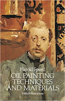
Welcome to the GJ Book Club. Today we'll cover pages 242-245 of the chapter on "Materials," from Harold Speed's 1924 art instruction book Oil Painting Techniques and Materials.

I'll present Speed's main topics numbered in boldface type. If you want to add a comment, please use the numbered points to refer to the relevant section of the chapter.

In this section of the chapter, Speed discusses grounds for oil painters. By "grounds" he means the prepared surface that you paint on.

Whistler, detail of oil painting (Source MOMA)
1. Advantages of a brilliant white surface.
Better permanency because oil paint always becomes more transparent with age, so a dark ground will show through and influence the painting in time. Oils also darken as they age, so if they're painted on a white ground, if they darken and transparentize, the two effects mitigate each other.

Disadvantage is that it's not always a sympathetic surface because it can be hard to judge values and colors against the bright white.

2. Recommended toned ground
Mix ivory black and raw umber to make a neutral color, thinning it with turpentine and applying it with a clean rag. Wiping with the rag gives an even tone and brings out some of the grain of the canvas.


3. Texture of ground
Speed says, "A perfectly smooth surface is not often used nowadays, although beautiful work has been done on it in the past. It is essentially the surface for very thin painting and high finish when soft brushes are used. The paintings of the pre-Raphaelites were done on such canvases.

4. What the ground should do
The surface texture should "pick the paint off the brush evenly without any scratchiness." And it should "hold the first touches painted sufficiently firmly for other touches to be painted evenly across them, without picking up the under paint unduly."

Speed complains about canvas manufacturers making prepared canvases with a slippery, soapy surface, which makes the paint slide around uncontrollably. A prepared canvas shouldn't be slippery and smooth; it should have a "bite" to it, a slightly gritty feel.

5. Coarse vs. fine canvas
A coarse canvas is good for large, simple masses of color—"the grain of the canvas breaks up the surface slightly and gives it a little movement, whereas on a smooth canvas, it is dull and lifeless." Beginners should start with a medium-grained canvas and then experiment with rougher and smoother options.

6. Absorbent canvases
Although paintings done on absorbent canvases may dry matte, the surface will absorb the oil, which tends to darken with time. Absorbent surfaces are suited to high key paintings, but they're not as good for dark subjects.

Dry, matte-surfaced paintings should be framed under glass, as dirt will settle into the rough surface of the paint. When Speed says, "Dirt is the great enemy of permanency in our modern cities," remember, he's talking about a London that was regularly blackened with coal smoke, and it really damaged paintings more than today.


Next time— Palettes
-----
In its original edition, the book is called "The Science and Practice of Oil Painting." Unfortunately it's not available in a free edition, but there's an inexpensive print edition that Dover publishes under a different title "Oil Painting Techniques and Materials (with a Sargent cover)," and there's also a Kindle edition.
----
GurneyJourney YouTube channel
My Public Facebook page
GurneyJourney on Pinterest
JamesGurneyArt on Instagram

@GurneyJourney on Twitter

Thursday, June 23, 2016

Nature Fest at the LA Natural History Museum

Photo courtesy of the Natural History Museum of Los Angeles County
Natural History Museums love artists! This weekend the Natural History Museum of Los Angeles County will host a "Nature Fest." Members of the local group of LA Urban Sketchers and others from Plein Air painting community will be painting and sketching at the location.

Photo courtesy of the Natural History Museum of Los Angeles County
Museum scientists and dozens of Southern California nature organizations will be on site to answer questions, and there will be behind-the-scenes tours of the ornithology collections.

Painters are normally prohibited from painting in the Museum's outdoor nature gardens, but during this weekend, they're allowed.

Ongoing programming includes roaming performances, hands-on activities, landscape artists in residence at work, as well as a chance to take a photo with "Charles Darwin."

Nature Fest at the Natural History Museum of Los Angeles, June 25 and 26.

Time Lapse of Urban Life


The Lion City II - Majulah from Keith Loutit on Vimeo.

This video combines a lot of sophisticated time lapse techniques to provide a dynamic vision of life in the city.

Wednesday, June 22, 2016

Spider Flowers

At the NY Botanical Garden last weekend, I decided to get close enough to a couple of flowers so that I could study their structure, and not just paint them as faraway blobs. 

A group of flamboyant spider flowers or cleome drew me into their orbit.

Cleome, casein on canvas mounted to panel, 11 x 14
I chose casein on canvas because it allows me to overlap opaque strokes without picking up previous layers. This was especially helpful on the oval petals and the long filament-like stamens.

The palmate leaves get smaller as you go up the stem. In some of the lower areas I painted a variegated base color for the leaves and then pulled them out by painting the dark negative shapes between the leaves. 


I shot video coverage of the painting, which I'll release later. I'm thinking of doing a video feature called "Painting Flowers in the Wild" (which is quite different from painting cut flowers indoors).

On Sunday afternoon, the gardens were full of artists because it was Plein Air Invitational day. It was fun talking shop with experienced fellow painters. 

Tuesday, June 21, 2016

Painting a Victorian Couple in the Garden

Rod and Gretchen, colored pencil, watercolor, and gouache
Rod Caravella and Gretchen Fenston posed for me in Edwardian attire at the New York Botanical Garden, as part of the fun surrounding their summer exhibition "Impressionism: American Gardens on Canvas." 

Photo by Susan Toplitz
Last weekend was the Plein Air Invitational, with over 20 outstanding plein air artists coming to the gardens to paint on location. As soon as there's an online gallery of the results, I'll post a link.

Thanks to all who attended and the staff and volunteers at NYBG who engineered the magic.

Deadline Coming June 24 for the Weed Challenge


Friday is the deadline for the Weed Painting Challenge. It's free to enter, all media are accepted, and if you win, you get one of the rare "Department of Art" patches.

Here's the previous post: Weed Painting Challenge
Facebook Event Page where people are posting their results.

And there are some amazing results that people are posting. But don't be intimidated if you're new at outdoor painting. You'll get lots of feedback and encouragement from the community. We're all trying to push the boundary of what we can do. I'll go through and press "like" and comment after all the pieces are in.

Monday, June 20, 2016

NSPCA Exhibition Opens Today at the Salmagundi


I was honored to learn today that my plein-air painting "Incident on Kelly Street" won the NSPCA Award for Casein Painting.

The original of "Incident at Kelly Street" goes on exhibit today at the Salmagundi Club in NYC with the annual showing of the National Society of Painters in Casein and Acrylic.


Marjorie commented: "I don't understand the car in the air." 

Well, Marjorie, strange events seem to take place when I'm out painting, and that day a thunderhead-sized floating island drifted overhead, sent a bright beam of light down on all the old VWs, and then lifted them up. I don't understand it either, but I just paint what I see.
-----
National Society of Painters in Casein and Acrylic show will be up through July 1. 
The painting is documented on my feature tutorial Fantasy in the Wild

Sunday, June 19, 2016

Painting Ice Water in Gouache


I couldn't find anything else to paint, so I painted the cup of water. (Link to YouTube)

Ice Water, gouache, 5 x 8 inches.
But looking at that ice water made me thirsty so I had wait a half hour before I could drink it.
-----
Download the Gouache in the Wild Tutorial
Materials Pentalic watercolor sketchbookHolbein gouache setSchmincke half pan setgamboge watercolor


Saturday, June 18, 2016

Plein Air Invitational


This Sunday I'll be part of a Plein-Air Invitational at the New York Botanical Garden. (Link to YouTube).


There will be more than 20 invited out-of-door painters, including Paul BachemGarin BakerEleinne BasaZufar BikbovShari BlaukopfMike BuddenArmand CabreraHiu Lai ChongDenise DumontLisa EgeliMary Anna GoetzElissa GoreFrank GuidaJames Gurney, Jeanette Gurney, Stapleton KearnsJanice KirshChris MagadiniBrad MarshallLisa MitchellRicky MujicaSusan WeintraubStewart White, and Lois Woolley.

We'll be painting in several locations around the Gardens. Although this isn't a workshop, and it's not an open call for other painters that aren't on the list to bring their easels, it's a good chance to quietly observe various setups and ways of working.

You can also see a couple of the paintings that I've done while in residence there if you visit the gift shop.

If you're a beginning artist or you have kids who want to draw and paint, there is a special garden area to learn to work from nature, with free materials and guidance from an instructor.


All this is to support and celebrate the exhibition in the NYBG's Art Gallery of American Impressionism by artists such as Maria Oakey Dewing, Matilda Browne, Childe Hassam, William Merritt Chase, and John Singer Sargent, and a garden interpretation by Francisca Coelho, NYBG's V.P. for Glasshouses and Exhibitions.
NYBG "Impressionism in the Garden"

Friday, June 17, 2016

Painting a Moving Subject


Excerpt of the new video feature "Portraits in the Wild." (Link to YouTube Video)

Blog reader Bjorn asks:
"I do 15 minute portraits at business fairs. Of course no one is able to keep a smile for that long. So when I draw what I see, the people relax their facial muscles. But since we are used to photos with people grinning and smiling, the person portrayed looks angry by comparison. I can imagine that in the days before photography a portrait was perceived differently.

When I try to "invent" a smile on the sitters face it looks wrong because I just make a kind of "C" moon shape of the mouth, but smiling is a much more complex process. So how do I prevent a person from looking too angry in a portrait? Or, what makes someone look friendly?


Hi, Bjorn,
That's a great question. You're right: most portrait clients don't want the portrait to look grim and serious. And as you say, most people just don't smile on command, nor do they smile all the time (naturally, at least). So often the default, relaxed position for someone's face when it's "under the microscope" of a portrait artist is rather serious. If we ask the subject to hold still for a long time, that's what we'll get—bored, sleepy, or grim.

The quick answer is not to worry about showing your subjects smiling. Think more about showing them in an animated expression that is characteristic, even if it isn't exactly a smile. They key is to keep the subject engaged and talking while you sketch them. They don't have to be smiling with their teeth showing, but if they're animated while they interact with you, all the muscles around the mouth and eyes will create a much more interesting and characteristic expression.

If the person isn't naturally a smiler, that characteristic expression might be the lips slightly parted in speech or the eyebrows raised. Sargent often painted his subjects when they were speaking, with their lips slightly parted—especially Henry James and Vernon Lee. You will be able to observe those momentary expressions as they cross the subject's face naturally. That's exactly what I demonstrate in the video, especially on the portrait of Scott Corey, who is talking non-stop throughout the portrait.

“In this clear, friendly tutorial, Gurney demonstrates the overlapping roles of observation and invention in portraying scenes of real life outside the studio. For artists at all skill levels, Gurney offers both a wealth of practical tips for making art under chaotic conditions, and a vivid example of the practice of seeing value and meaning in all people, places, and things.”
—Daniel Maidman
Portraits in the Wild 
Download (66 minutes, 1080p HD widescreen MP4 video) Available at GumroadSellfy, and Cubebrush.
DVD (NTSC widescreen with slideshow) Available from Kunaki.com and from Amazon.

Thursday, June 16, 2016

Mesozoic Gliding Mammal

This little Mesozoic mammal, Volaticotherium, is flying off the newsstands. 
----
Watch a trailer of the behind the scenes making-of video
In the June issue Scientific American.

Painting Singers While They Sing


(Link to video) When I set up my easel on the sidelines of an old-time singing convention, I didn't know what to expect.

I worried that I would be disruptive, but they were so wrapped up in the music, they hardly noticed me. I just had to move my easel at one point to stay clear of the stampede at the lunch table. 

On breaks, each of the women I was painting was pleased to see themselves show up in my sketchbook.

Palette of casein colors. Mixing surface is a
metal pencil box lid spray painted white
Once I realized that all the singers would be changing seats and moving around between songs, I had to streamline my approach. That meant: 1) Drawing with the brush, 2) Premixing commonly used colors, 3) Finishing each person in turn.

This video segment is 30 minutes long in the full tutorial. It's the longest single painting demo I've yet done on one of my videos. This was in response to a request from you to show longer and more complete coverage of paintings from start to finish.

Portraits in the Wild 
Download (66 minutes, 1080p HD widescreen MP4 video) Available at GumroadSellfy, and Cubebrush.
DVD (NTSC widescreen with slideshow) Available from Kunaki.com and from Amazon.

Wednesday, June 15, 2016

Your Comments, Questions, and Shares from the LiveStream

On Monday's live stream, we had people from Wales, Canada, U.K., Germany, Brazil, Chile, Colombia, Slovakia, India, Phillipines, France, Singapore, Malaysia, South Korea, Puerto Rico, California, Arizona, Texas, Baltimore, Ohio, and NYC (to name a few). Thanks to everyone who joined in.


And congratulations to Faisal Tariq  for winning the Best Question prize (Signed, First Day Cover of Australian Dino Stamp), Sherry Pound West for winning the best comment (You get a Dinotopia Collector Card Pack), and Deborah Secor for winning Best Share (You get a Department of Art Patch). 


Questions

WINNER: Faisal Tariq 
Does painting in Gouache help you with painting in oil? (Or more generally painting in one medium help with painting in another medium?)

The answer is YES. Painting in an opaque medium like casein or gouache is in many ways more like oil than it is like transparent watercolor. You can approach the sequence of steps in the same way (such as 1. toning board, 2. background, 3. shadows, 4. halftones, 5. lights, 6. highlights and accents.) The main difference is that with water media every decision is greatly accelerated. Gouache encourages you to be direct and economical with your brushwork. That is, it makes you think about a stroke, mix it, and lay it down with one touch, rather than fussing back and forth with it. 

When you return to oil, that economy of means and directness pays off too. You'll be a faster painter. Oil's properties don't encourage directness and economy as much. 

Transparent watercolor is almost a different animal from all the others. It requires kind of an inside-out thinking because you have to paint around the lightest areas, and that takes a certain amount of planning and deliberation. But at the same time it wants you to be intuitive, decisive, and spontaneous. All good qualities to bring to any kind of painting.

Other excellent questions (sorry I couldn't get to them all):

Charles Valsechi
Do you intentionally reduce the value of the light side to create more form? (The white head sculpture appears lighter than your painting.)

Yes, usually I restrict the value range of the light side and lighten it a bit, and I try to unify or group the values of the shadows. Then the painting becomes simpler, more poster-like, and more attention goes to the all-important light-to-shadow transition, which was the obsession of Sargent and others. 

BTW, I spray painted this plaster head to a light gray so that its brightest light would come close to the white of the paper. If the maquette was white, there would be no way to match the apparent values on a 3D form using  a white-to-black range of paint on a 2D surface.


Kent Gardner
Gouache -- Prior to watching your videos I never thought of it as a fine art medium. Is it true that historically it has used mostly by commercial artists for illustration that was to be reproduced?

Yes, besides all its uses in the design field, gouache has a rich history as a gallery art medium, particularly among French academics like Vibert and Leloir.

Wael Mizo ·
My Question: is there any way to darken specific colors in value for the shade sides of an object in shadow with its complement without losing its saturation, for example green or red - do objects in real world losing its saturation in their shadow sides along with value?

If you use the complement to darken a color, it will lose saturation. But that's OK because objects typically will lose saturation in shadows. Not always, however. If the shadow side is receiving strongly colored light that matches the local color, it may be higher in chroma (or saturation) than the light side.

Christopher Seubert · Thank you for the demo and all the information and instruction you have passed on. Truly enjoy your posts, videos, blogs and books. Question: who was your most influential instructor/teacher?

Ted Youngkin, my perspective teacher at Art Center, and also my high school teachers Bill Burnes and Bill Goggin. Beyond them, I didn't have too many living teachers. The ones I learned from most were from books, namely by Rockwell, Loomis, Speed, Solomon, Carlson, and Bridgman.

Max Chew Zishen I noticed you were flipping through your sketchbook and every painting is knocking it out of the park! Have you not had any clunkers or bad starts, or did you cut them out of the book?

Thanks, Max. I've had plenty of clunkers and bad starts. I'd say that about 20% are experiments that didn't work the way I had hoped. If I can't fix them, I don't cut them out. Instead I paint over them in casein and have another go on another day.

Joseph Matthew Sebastian Garcia
"I am just wondering how you might light this piece if you were to display it? The values seem cool, but I find, working with a monochrome palette in gouache, that the greys tend to look blueish. Also, does warm lighting even affect the overall look of this piece?"

I added raw sienna and ultramarine blue to the palette alongside the black and white in case I wanted to offset the cooling effect of white on grays. The piece should look OK in any light, warm or cool, as long as the relative color temperatures are good in the painting. But I wasn't too worried about the color temperature for this exercise since I was mainly focused on value.

Deus Ex Machina ·
Hello from Germany, i really enjoy the painting in the wild series! i was wondering if you have a certain technique for preparing and or exploring with color (e.g. watercolor) swatches in a sketchbook? Not necessarily for a certain motive, but abstract studies. Actually, I would love to see a in depth tutorial about making colored thumbnails :)

Yes, I have developed a swatch chart that I love to use for limited palettes. I don't usually paint pure abstracts, but instead look for abstract possibilities in real scenes.

Matthew Enns Do people look at you funny when you paint out in public?


I do like them for gouache and casein because they have good snap and edge definition, especially in the flats. Casein should be used with synthetics because the ammonia content can be hard on natural fibers.

Sam Gauss When you're learning a new paint medium, is this the sort of exercise you'd recommend? Grayscale?

Yes, for people new to gouache or new to physical painting, I recommend painting in black and white. It helps to reduce the variables, so you don't have to worry about hue or chroma.

Khoa Tran hi james,is the department of art a real thing? Like a club or something (I'm from vietnam btw)

The Department of Art is the name for me, my wife, and a few painting buddies of ours.  One of our blog compatriots, Steve, generously contributed a supply of embroidered patches. Sometimes we use the patches for special prizes. We made matching uniforms with our names and patches so that we look official when we're street painting. We also have traffic cones marked that way. 

Best Comment
Sherry Pound West Watching you while on my way to eye surgeon. May get interrupted by the surgeon!

Best Share
Deborah Secor
I really enjoyed your demo. I have a group of about 200 people and enjoyed sharing the live link, plus posting a screen shot I took as you said hi to us! The personal touch is very nice. Thanks so much. You two were remarkably able to handle all the challenges that came your way, including the technical ones. Great teamwork. :D
-----
FaisalSherryand Deborah, please email me your address so I can send out your prizes.

Tuesday, June 14, 2016

Gouache Head Demo in Six Acts

Yesterday at a college coffeehouse, I did a little gouache demo on Facebook Live.

In case you don't do Facebook or missed the live stream, here's the archived video. The demo is broken up into six chapters because the stream kept freezing for some reason. 

You can skip ahead to episodes 4, 5, and 6 if you want to get to the main part of the painting.

Part 1 Intro—Sketchbook walkthrough


Part 2 —Drawing starts at very end


Part 3 —Pencil drawing and painting background


Part 4—Painting shadows, cutting edges, and defining basic forms.


Part 5—Lighter halftones


Part 6 —Dark accents, refining contours, losing edges


The point of this grisaille study was to present a good exercise for those of you who are getting to know gouache, or who are just getting into painting. You can do most of your drawing with the brush, and here the main focus is on value rather than worrying about color.

The head is one that I sculpted based on George Bridgman's analysis of the head, and it's intended to show the simplified planes of the head, keeping in mind the skull underneath, but ignoring the surface features.
(b)  Highpass filtered face; (c)  Lowpass filtered face (source)
This 'big plane' approach to the head also corresponds to what neuropsychologists call the 'low spatial frequency' forms of the face—the big, blurry forms—as opposed to the network of smaller lines that beginning artists usually draw first. Those low spatial frequency forms are perceived peripherally, and play a big role in facial recognition and perception of emotion. Read more about the work of Margaret Livingstone and visual perception of faces here.

Portraits in the Wild 
Download (66 minutes, 1080p HD widescreen MP4 video) Available at Gumroad and Sellfy.
DVD (NTSC widescreen with slideshow) Available from Kunaki.com and from Amazon