Sunday, July 31, 2016

Live Action Role Playing

Live action role playing. Watercolor pencils and water brushes.

Saturday, July 30, 2016

Menzel and Photography

In the comments about yesterday's post about Adolph Menzel, Tom Hart wondered about Menzel's relationship with photography and mechanical drawing aids such as a camera obscura.

Drei Rüstungen und zwei Helme. [Three suits of armor and two helmets]. 1866.
Gouache on toned paper. 41.1 x 31.7 cm. [16.1 x 12.5 in.] KK.
Copyright © bpk/ Kupferstichkabinett/SMB/Jörg P. Anders
Tom, I haven't found any evidence that Menzel ever used a camera obscura. But he was definitely aware of the benefits and pitfalls of reference photography to the artist, and he wrote about the issue. 

He owned a collection of photographs of armor and weapons from the history museum in Dresden, but he still drew from observation the historical props he needed for a given picture, partly to understand them from different angles. 

[Portrait study of Maximilian von Schwerin-Putzar]. 
1864. Pencil, watercolor, gouache on toned paper. 30.1 x 22.5 cm. 
[11.9 x 8.9 in.] KK. © bpk/ Kupferstichkabinett/SMB/Jörg P. Anders14 

In general, he rejected the use of reference photography unless it was absolutely necessary. In the early 1860s, when he was preparing the gigantic painting of the Coronation of Wilhelm I, King of Prussia, he had to paint 132 portrait likenesses. He could have used photography for reference, but he chose to work from life studies instead.

Portrait study of Emil von Webern. 1863. Pencil, watercolor, heightened with white on toned paper. 
28.9 x 23.0 cm. [11.4 x 9 in.] KK. Copyright © bpk/ Kupferstichkabinett/SMB/Jörg P. Anders 

Menzel wrote that the use of photography “is diametrically opposed to my belief in the responsibility of the artist to art and his self-confidence; and even the continuation of such a method must necessarily lead to the loss of discipline in certain important powers of the eyes, the hand, the memory, and the imagination concerning animated nature.”

Emilie und Richard [Emilie and Richard]. 1865. 
Pencil on paper. Courtesy of Dr. Czok, Chairwoman, Adolph Menzel Society. 
Such attitudes may have seemed old fashioned to many of Menzel’s contemporary artists, who by the late nineteenth century were beginning to rely on photography’s documentary powers. In fact, Menzel was keenly interested in the new invention. Starting in 1864 his brother Richard ran a successful photography business, which produced reproductions of Menzel’s work.

After Richard’s death, Menzel advised his sister-in-law in the running of the business. According to Max Liebermann, who knew his artistic sensibilities well, “His visual sense, naturally inclined towards the observation and reproduction of the tiniest details, received fresh stimulus from photography.”

This is an excerpt from the Introduction of my new book from Dover. The images in this post all appear in the book. The book contains 130 images, including 32 pages of color. Note: the listing on Amazon shows the incorrect cover.

Here's the link if you'd like to order a signed copy from my website store (I can ship to addresses in the USA only, because of the high shipping rates overseas, sorry). If it's a gift book and you want me to sign it to someone in particular, just make a note on the order form.

Adolph Menzel: Drawings and Paintings from JamesGurney.com

Friday, July 29, 2016

Menzel the Sketcher


Adolph Menzel’s drawing supplies accompanied him everywhere, whether on a short walk or a long journey. He was always prepared to draw. One of his overcoats had eight pockets, each filled with sketchbooks of different sizes.

On the lower left side of his coat was an especially large pocket which held a leather case with a big sketchbook, some pencils, a couple of shading stumps, and a gum eraser. 

Bärtiger Mann herabblickend [Bearded man, looking down]. 1887.
Carpenter’s pencil on paper. 20.8 x 12.8 cm. [8.2 x 5 in.] GSS 


His personal motto was “Nulla dies sine linea” (”Not a day without aline”). He drew ambidextrously, alternating between the left and the right, sometimes on the same drawing. 

If he was ever caught without drawing paper, he sketched on whatever was available, even a formal invitation to a court ball. Whenever he was spotted at a social event, the whispered word went abroad that “Menzel is lurking about.”

Zeichender Junge, am Tisch [Boy drawing at a table]. 1837.
Pencil. 16.6 x 10.3 cm. [6.5 x 4.1 in.] KK.
Copyright © bpk/ Kupferstichkabinett/SMB 

He was known to interrupt an important gathering by pulling out his sketchbook, sharpening his pencil, casting an eye around the room, and focusing on a coat, a chair, or a hand. This sometimes brought the proceedings to a halt until he finished. 

He preferred to draw people unawares, often catching them in unflattering moments of eating, gossiping, or dozing. Once his friend Carl Johann Arnold awoke from a nap to find the artist busily drawing his portrait. “You just woke up five minutes too early,” Menzel told him. 
--------


This is an excerpt from the Introduction of my new book from Dover. The images in this post all appear in the book. The book contains 130 images, including 32 pages of color. Note: the listing on Amazon shows the incorrect cover.

Here's the link if you'd like to order a signed copy from my website store (I can ship to addresses in the USA only, because of the high shipping rates overseas, sorry). If it's a gift book and you want me to sign it to someone in particular, just make a note on the order form.

Adolph Menzel: Drawings and Paintings from JamesGurney.com

Thursday, July 28, 2016

Menzel Book Now Available

I'm pleased to announce that my new book on Adolph Menzel is now available, and you can get a signed copy today.

This art book collects the best of his drawings, watercolors, pastels, and gouaches, many of which have never been published before.

Adolph Menzel (1815-1905) exhibited tremendous powers of observation and an interest in a wide range of subjects.


Bildnis Friederike Arnold [Portrait of Friederike Arnold]. 1847.
Pastel, highlighted with Chinese white on brown paper. 45.2 x 24.5 cm. [17.8 x 13.6 in.] GSS
Menzel drew and painted everything—people, animals, architecture, and landscapes. His drawings and watercolors were revered by contemporary realists for their truth to nature and technical accomplishment.

He was also a master of historical illustration, and this collection includes some of the best examples of his imaginative realism.
Halberstadt, Dom: Blick auf das Chorgestühl. [Halberstadt, Cathedral: view of the choir stalls].
1850/1864. Pencil and watercolor. 20.3 x 11.5 cm [8 x 4.5 in.] KK.
Copyright © bpk/ Kupferstichkabinett/SMB
The book has been over four years in the making. It took a long time to get the rights cleared.

I selected the drawings and paintings in this volume from vast archives of his work (he was extremely prolific), and I also wrote the introduction. I was lucky to have the help of my Berlin friend Christian Schlierkamp, who, along with Christoph Heuer, interviewed top Menzel scholars, translated journals and letters, and went to the museums there to locate unusual works that hadn't been published before.

The book also includes two short essays by leading Menzel scholars Claudia Czok and Claude Keisch, who describes Menzel's studio in detail.

The publisher is Dover, and they did a fine job reproducing the art from high resolution files taken from the original art.


The result is a labor of love that we are very proud of. This is the finest collection in print of the drawings and watercolors of an unjustly overlooked artist. It contains 130 images, including 32 pages of color. Note: the listing on Amazon shows the incorrect cover.

Here's the link if you'd like to order a signed copy from my website store (USA only, sorry). Adolph Menzel: Drawings and Paintings, Introduction by James Gurney, and signed by the Editor. The first 30 copies ordered will be signed by both me and my co-editor Christian Schlierkamp.

Edit: Here's a well-illustrated video biography with German voiceover (link to YouTube) Thanks, Vanessa!

I'll share excerpts from my introduction over the next week or so.

Wednesday, July 27, 2016

Paramount Lighting

Paramount lighting is a lighting setup where a strong key light is placed directly in front of the subject with a slight downward angle, lighting the subject evenly from in front.

Marlene Dietrich, source Pinterest
It got its name from the classic glamour shots of Hollywood celebrities like Marlene Dietrich, who insisted on it. It's also called butterfly lighting because the shadow under the nose looks like a butterfly.

If the model is looking right at you, you need to have the light on an extension arm so that the light pole isn't blocking your line of sight. The diffusion on the key light can vary depending on the effect you want. Sometimes you need a softbox or a reflector as a fill light to reduce the harshness of the shadows.

Paramount or butterfly lighting off-angle Source: Zealfaith
It's still Paramount lighting if the subject is looking off to the side. Paramount lighting emphasizes the cheekbones and can be both flattering and dramatic.

Question for discussion: Do any art schools teach courses on lighting for artists? It seems like a basic thing all artists should know, but in my experience, photographers know this stuff, but most artists don't.
-----
Related Posts on Portrait Lighting:

Tuesday, July 26, 2016

Guinea Fowl and Donkeys

Guinea fowl keets, watercolor, 5 x 8 inches
Over in the barn, they've got another load of hay into the loft. The guinea fowl hatchlings (called keets) have moved into a larger enclosure. Peanut and the other donkeys got their summer haircuts. They spend these hot days in their barn stalls cooling off in front of the fans.

Monday, July 25, 2016

Ten Tips for Better Brushstrokes

Over on my Instagram page, Sean Walsh asks: "What are some tips for getting better with brushstrokes? Yours are so deliberate and telling. They do so much despite having almost no detail. Is it a "better with practice" sorta thing or is it something you've focused on specifically?"

Thanks, Sean, and those are good questions. Here are ten tips.


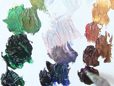
1. Mix plenty of paint
If you prepare plenty of paint on the palette, you're more likely to use it. Sometimes a big, juicy stroke full of paint is what you need for a passage. With oil, do this mixing with the palette knife before the painting session. You'll save yourself a huge amount of time, and it will triple your painting speed. Here I'm loosely mixing value strings of green, gray-violet, and orange.

2. Use it thinly, too
Although thick, generous paint is attractive, also be ready to use the paint thinly and delicately. Have a tiny brush for extremely delicate details. Have a soft blender to blur out some areas. Rarely should a painting be covered equally with thick paint strokes. Variety of handling is almost always desirable.

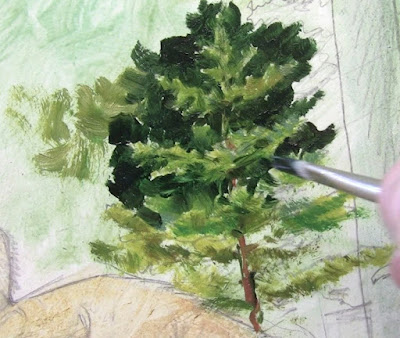
3. Variety of brushes
Use a lot of different brushes: big ones, small ones, synthetics, natural fibers, stiff ones, soft ones, flats, filberts, new brushes, and old splayed out brushes. Experiment with them all and get to know what you can do with them. With old brushes you can push and pound with them (moving the brush in the direction of the brush tip) as well as the typical movement of gently stroking away from the tip.

4. Big brushes
Before you start painting, select a family of brushes that you expect will do the job. Five or six will often be enough for a given painting. They should range from large to small. But for any given passage, choose the biggest brush you can get away with for that passage.


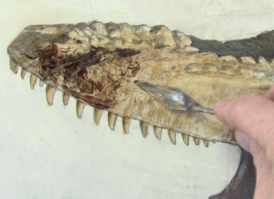
5. Don't forget the painting knife
The painting knife is useful not just for mixing paint, but also for applying it. Use it for troweling on paint and for dropping in random textures. Here I'm dragging dark paint over a dry underpainting, so I can pull it over the bumpy underpainting. I can get textures this way that I could never get by diligently painting stroke by stroke.

6. Scratch through
Don't forget that you can scratch through the wet paint with the tip of your brush handle. This works with wet oil paint. Scratching through is a good way to sign an alla prima painting. (An alla prima painting is executed from start to finish all in one session.)


7. Use the edges and corners
Flat brushes are really three or four brushes in one. The knifelike edge can give you thin lines or hairs, and you can use the corners for details that are smaller than the width of the brush. Filberts were invented because they have advantages of both flats and rounds.

8. Make every stroke count
There's no formula for good technique, but most often it comes from a sense of urgency and economy. Use whichever touches convey the most information about your subject with the least effort. That doesn't mean you have to be hasty and loose, but rather that you think before you mix and apply paint. Great painters of the past have often been described as holding their brushes above the canvas deliberatively before going in for the stroke.


9. Better with practice 
Yes, it gets better with practice. The best kind of practice is painting from living subjects in changing light, because the dynamics and risk adds more focus than you're going to get under controlled studio conditions.

The deliberate, thoughtful but efficient stroke-by-stroke consciousness becomes second nature as you focus more attention on the subject rather than on the surface features of your painting. Think how economical and automatic your movements are when you wash dishes or tie your shoes. That's the way you want your brushwork to be. Your brushwork should be deliberate and controlled, but occasionally wild and impetuous.

10. The test of good technique
As you paint, your ultimate goal is to think beyond the strokes, the way a race driver is thinks about the line they're taking on the turn, not about how they're holding the steering wheel. Try to think as much as you can about the thing you're painting and how its made and how the light is playing on it. If you can do that and reach for the brushes more unconsciously, you'll be more likely to make the brushstrokes less attention-getting.

So, what's the test of good technique? Ideally the viewer shouldn't notice it. Rather, their awareness should be directed to features of your picture that are on a higher level, like the light, mood, or story.
----
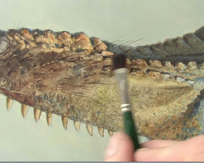
The images in this post are from my tutorial video Tyrannosaurs: Behind the Art, which demonstrates oil painting techniques and brushwork in the context of reconstructing extinct dinosaurs.

Follow me on Instagram

Sunday, July 24, 2016

Norman Teeling Painting on Location


Dublin artist Norman Teeling (born 1944) describes the experience of painting on location. "When I paint a picture," he say, "I want to be elevated, I want to escape from the mundane and enter a world of the romantic whether it be an interior or a landscape."
Thanks, Garin.

Splitting Color Illusion


This optical illusion by  shows two identical, flickering colored stripes that remain the same throughout the presentation. As the background colors change around them, however, the stripe changes its appearance.

Discoverer Mark Vergeer says, "When the stripe is flanked by a yellow/blue pattern, drifting to the left, it changes appearance, and looks red and cyan, drifting to the right, while the same stripe, flanked by a red/cyan pattern drifting to the right, suddenly looks yellow and blue, drifting to the left. This illusion shows that one and the same object can look completely different depending on its surroundings."

"Splitting Colors" was awarded the "Illusion of the Year" in 2015 (Link to video on YouTube)

Saturday, July 23, 2016

Joe Derrane (1930-2016)


Yesterday we lost one of the great Irish accordion players, Joe Derrane, at age 86. We saw him at the Paddy O'Brien festival in Tipperary soon after his triumphant return from retirement. Joe played the dance halls in Boston in the 1940s in a highly ornamental style that was all his own. 

"When I focus on it, I can crawl inside the music," he said, "and let it take me wherever it wants to go."


Brief video clip: (Link to YouTube
Wikipedia on Joe Derrane

Friday, July 22, 2016

Reminder: Food Truck Challenge

Reminder: The Food Truck Painting Challenge is ongoing. The goal is to paint a vehicle used for mobile catering. It's free to enter and the deadline is August 15.


This is an old milk wagon that I sketched when I was an art student.

Read all the entry requirements and parameters of the Food Truck Painting Challenge. (link fixed)

Thursday, July 21, 2016

Pencil Accents

Here's a sketch of a barn in upstate New York. 


After a quick lay-in where I carefully measure all the perspective and spacing, I lay down some big washes on thin watercolor, very slightly warm and cool, with a few orange color accents.


The pencil then describes textures and details, from the fine wires on top of the ventilators to the rough texture of the shingles. I like to use two pencils, such as an HB and a 2B pencil, one for the light lines and the other for the darker accents.

Wednesday, July 20, 2016

Fine Art and Illustration


Blog reader Gary Gowans asks: "Where do you draw the line between fine art and illustration? How about galleries? Does it matter? I have been painting just short of photo realism and am in several good galleries BUT, I love the illustrators of the Golden Age as well as like Fuchs, English, and Robt. Heindel to name a few." 

Answer: Yes, Gary, it matters, because words matter. Words shape the way we arrange the furniture inside our minds. I believe that you can love the great illustrators while you paint for galleries.

I try not to draw a line between fine art and illustration, because both terms are impossible to define and the distinction is meaningless.

By "fine art," some people mean gallery art. For some people the term suggests a branch of art that's supposedly free from commercialism.

Having been involved in all sorts of art-making, I can attest that gallery art can be liberating, because you can paint whatever you want, especially when you're getting started. But once paintings start selling, things change, and the gallery career can become the most commercial of all. Gallery artists are always reminded of what's selling, and what's not, and are pressured by the marketplace to repeat successes more than any other kind of art.

There's nothing wrong with making art solely with the intent to sell it. We've all got to make a living. And it's possible for a gallery artist to be unaffected by thinking about sales and prices, but it's not easy. Are you going to keep doing those experimental things that you love doing when that last show got no red dots? 

The least commercial art form I've ever experienced is magazine illustration, where the individual work of art has no measurable influence on the ultimate commercial success of the larger work, namely the magazine. If any art is "fine" in the sense of being non-commercial, it is illustration.

“Illustration” is a term that means different things to different people. It can mean: 
1) work that’s commissioned.
2) work that tells a story.
3) or work that is reproduced. 

Those are very different criteria, and none of them should be grounds for disparaging artwork. There have been great works of art that fit one, two, or even all three of these measures. Work has been commissioned by publishers, and before that by popes and kings, often formatting them very specifically for altar pieces or tombs. Artists have always been capable of inspired work under such conditions.

Work that tells a story includes all great artwork, not just painting, but also movies and novels. How could that not be the highest calling? And work that is reproduced just brings it to a larger audience, as the phonograph has done for music. Live musicians don't disparage musicians who make recordings, so why should art that's printed be any different?

So let yourself love whatever artwork speaks to you. Whatever kind of artwork you do, throw your heart into it. Now I guess the next question is: So are we all artists, then? Too late to call ourselves artists, because musicians and actors have stolen that term!

Tuesday, July 19, 2016

Gender Contrasts

Third Place, Illusion of the Year, 2009
What can you say about the gender of these two faces? 

They're sort of on the borderline, but if you had to say one was male and the other was female, what would you say?

Most people say the face on the left is female and the one on the right is male.

This is just an illusion because they're both the same androgynous face. The only difference is that the contrast of the features is increased in the face on the left, and the contrast is reduced in the face on the right.

According to the psychologist Richard Russell, who created of this illusion, "Contrast is an important cue for perceiving the sex of a face, with greater contrast appearing feminine, and lesser contrast appearing masculine."

He observes that cosmetics in women serves to heighten this difference, increasing the contrast, particularly around the eyes and mouth. "Female facial beauty is known to be closely linked to sex differences," he says, "with femininity considered attractive. These results suggest that cosmetics may function in part by exaggerating a sexually dimorphic attribute—facial contrast—to make the face appear more feminine and hence attractive."

Monday, July 18, 2016

Jason Morgan reviews Imaginative Realism


(Link to YouTube) Professional wildlife artist Jason Morgan does a page by page walkthrough of Imaginative Realism: How to Paint What Doesn't Exist. Thanks, Jason!
----
Order a signed copy of Imaginative Realism from our website (USA only)

Sunday, July 17, 2016

Physiognomy: Comparing People to Animals

Can you guess a person's personality by the shape or appearance of their head? Do some people look like animals, or some animals look like people?


Those were questions asked by people in the field of Physiognomy. Here Italian scholar and playwright Giambattista Della Porta compares a sharp-featured man with a hound, in De humana physiognomonia, in 1586.


To Della Porta, another man's face resembles that of a bull. (More examples from Della Porta are at Public Domain Review.

The question kept appearing since the days of the ancients: Does the face determine someone's destiny, or does the face reflect the life they've lived? 

Leonardo rejected the first proposition but accepted the second. He said, "Lines caused by facial expressions could indicate personality traits. For example, he wrote that "those who have deep and noticeable lines between the eyebrows are irascible."

Charles Le Brun
In the late 1600s, French painter Charles Le Brun did a series of drawings of physiognomic heads, comparing a variety of metrics such as the axis of the eyebrows and the angle of the eyes, and he drew parallels between they faces of certain human characters and those of animals. 

He was also fascinated with the way emotions played out on the face in humans and animals. Le Brun was influenced by the idea that the area around the eyebrows were of extreme importance, based on the discovery by Descartes of the pineal gland at the base of the brain. Descartes believed that spot was the seat of the soul.


The interest in this topic lasted well into the 19th century. In 1866, James W Redfield published Comparative physiognomy: or, Resemblances between men and animals


Though in recent times physiognomy has been discredited in scientific and academic circles, the idea still surfaces in the work of artists who design anthropomorphic (human-animal) characters
------

Saturday, July 16, 2016

Plein-Air Portraiture in International Artist


The upcoming August/September issue of International Artist magazine contains my article "Painting Candid Portraits in the Wild," which recaps nine recent adventures in plein-air portraiture.

In the article I address a question that comes up often:

Is it OK to Sketch Strangers in Public?
Yes. In most public places people have no expectation of privacy, and you have a right to sketch them. However, for both ethical and practical reasons, it’s better to assume otherwise. Whenever someone notices that I’m sketching them, I try to introduce myself, and I show them what I’m up to. My standard line is: "Hi, I'm just getting some practice sketching people, hope you don't mind. Keep doing what you're doing. I'll be done in five more minutes and I'll show you when I finish." Most often, they just want to take a photo for Facebook. If they look annoyed after I say that line, I’ll switch to someone else. But nine times out of ten, being open will erase their worries and perhaps make a friend. Sometimes I’m sitting too far away to make such a connection, or I’m dealing with a language barrier. In that case, I hold up the sketchbook and smile. That clears the air and gives them the opportunity to decline politely. If I want to do a portrait with a lot more commitment, rather than stealth sketching, it's best to get permission and set the terms at the outset. Then I can say something like, "Hey, are you going to be around here a while? I'm an artist and I'd love to sketch your portrait while we talk."

International Artist was voted the Best Art Magazine by GJ readers. 

Friday, July 15, 2016

Sunset at the Supermarket

Here's the view across the parking lot of the supermarket yesterday at sunset. 


Supermarket, gouache, 4 x 7 inches.
The painting sequence was a little different on this one. The sky is a transparent wash. I used ultramarine blue and burnt sienna gouache for the dark silhouettes. I painted tree darker at first, but I went in later with yellow and orange opaque gouache, painting the whole silhouette lighter as it approached the sun. 

I didn't have a camera at all to document the place or steps.

Thursday, July 14, 2016

How Movement Aids Face Recognition

Every face you're familiar with, whether friend or celebrity, has a distinctive shape and proportion. But familiar faces also have a set of characteristic movements. Those movements, scientists say, are stored in your memory, and play a crucial role in face recognition.


This effect is understood by actors who are masters of impressions. Watch as Kevin Spacey does a series of impressions (Link to YouTube). Before he even gets into doing the voice, he concentrates on the characteristic movement and posture of his subject.


The same is true with these "nano-impressions" by Ross Marquand. The movement is a bigger part of his impressions than the voice. For the impression to work, the movement, voice, words, and timing combined have to be powerful enough to override the contrary impression given by the impersonator's face metrics (Link to YouTube)


Psychology professors Karen Lander and Lewis Chuang of the University of Manchester showed in a research project that moving faces are much easier to recognize, especially when the person is moving in a distinctive way. An expressionless face simply rotating doesn't offer much. They write that the "distinctiveness of the observed motions may be important, with the beneficial effect becoming more pronounced as the face moves in a more "characteristic'' or distinctive manner."

This is why I don't mind if a portrait subject is moving. In fact, I like it more if they're moving. It gives me a better sense of their character, and helps me decide the best pose and expression.
-----
Tutorial:
Portraits in the Wild: Painting People in Real Settings
Resources
Why are Moving Faces Easier to Recognize? (free PDF of the study) by Karen Lander and Lewis Chuang
Previously: 
Eyebrows and Face Recognition
Disrupting Face Recognition Technology

Wednesday, July 13, 2016

Lovell Book Announced

Publisher Dan Zimmer has announced that he's working on a book about Tom Lovell's work as an illustrator. Here is the unfolded dust jacket design.

There was a previous book about Lovell from the 1980s, but it mainly covered his western art work. This one spans his whole career, focusing mainly on his magazine illustrations. 

The book begins with a biography and shows his early pulp illustrations. But this book will be mainly pure pictures, reproduced large, the way art books should be.

It includes the wide range of subjects: pretty women, male action, romantic subjects, and historical reconstructions. The book will include some scans of tearsheets so you can see how they appeared on the page. There's also some discussion of his method, with examples of his thorough preliminary sketch process. 


There are plenty of original art scans showing paint texture and brushstrokes. Lovell has always been the artists' artist, one whose style doesn't seem particularly locked into a given time period.

Young artists today can learn from his use of color, his sense of dramatic staging and lighting, his striking compositions, and his paint handling. You can see more page spreads from the book in a low rez preview at this link.


The Lovell book is coming out this October. Dan isn't doing a Kickstarter campaign this time because he's already got enough early orders to cover the printing.

Instead at this stage he's taking prepublication orders. Since this is a limited edition, it might be wise to order one now, because they'll probably sell out by the publication date (like his last book on Dean Cornwell) and they'll be hard to get after that.

Here are the specs:
The book is 224 pages, 9”x12”, full-color on premium low-gloss stock, hardbound with dust jacket.
A Standard Edition copy of the book is available for only $44.95 plus postage. It's limited to just 900 copies.
A Special Edition copy of the book is available for $65.00 plus postage.
The Special Edition book is signed and numbered with slipcase. Limited to 100 copies.

Tuesday, July 12, 2016

Painting a Complex Subject in Watercolor


(Link to You Tube) Painting in transparent watercolor requires careful planning, and that's especially true when there's perspective and lettering involved.

In this case I spent nearly one hour of the 2 hour session on the preliminary pencil drawing. After I was sure of that, the rest went pretty fast.
-------
Watercolor in the Wild Gumroad tutorial

Monday, July 11, 2016

Gouache Materials List

I was putting together a gouache materials list for an upcoming workshop, so I thought I would share it with you, too.


Surface
You can use illustration boardwatercolor paper in sheets, a watercolor paper pad or spiral bound watercolor sketchbooks. However, I prefer to paint gouache in 5.5 x 8.5 inch hardcover stitched-in watercolor journals.

The two I recommend are Pentalic watercolor journal (which has 100% rag, 100 lb paper), and the Strathmore 400 Watercolor Journal  (which has 140 lb paper and comes in hardcover and softcover formats). The Moleskine book is OK too, and has more pages than the other two, but the paper is thinner, so I'd recommend that one if you're doing more drawing and dry media compared to watercolor.

Brushes
• Flats, synthetic 1/4", 1/2", and 1"
• Rounds, synthetic or Kolinsky sable, assorted sizes 4-10

A good bargain is to get a watercolor brush set with carrying pouch (regular length handles) or a short-handled water media brush set with carrying case. The latter will fit over the left hand page of the open sketchbook.

There are a lot of brands available, including very expensive Kolinsky brushes, but I don't think you have to spend that kind of money for most purposes. The cheaper synthetics can be very good. If I find a good brush, I buy a few extras to have on hand. I've found brushes of acceptable quality at the big box craft stores for very reasonable prices, but you have to check them out. What you want to look for are brushes that have good spring or snap, not floppy. The brush should come to a fine point — or edge in the case of a flat. That way you can use a fairly large brush to paint your picture.

If you're painting in casein, use only synthetics; don't use natural hair brushes (bristles or sables) because the paint can be hard on the fibers.

Paint
The Holbein gouache sets are good quality, and you get a lot of colors for a good value. Holbein makes a set of 12 colors of the normal size 15 ml tubes. They also make a set of 18 that sells for an inexpensive price, but the tubes are much smaller, only 5ml.

They also make an Acryla Gouache line, which has a closed surface after it dries, meaning water won't dissolve the dry paint.

Winsor and Newton's set is good quality, but overpriced at $139. Edit: Here's a W/N 10-tube set for $43

Royal Talens  makes a set of 8 and M. Graham has a 5 color set, but they lack earth colors, one of the joys of gouache. You can always buy the set for the pure primaries and then supplement with individual tubes of raw sienna, yellow ochre, raw umber, and Venetian red or burnt sienna, plus black if the set doesn't come with it.

Shinhan Pass makes a 48-tube set of "hybrid" gouache/watercolor paints. They're pigment-rich, non-toxic, and use gum arabic as the binder and most of the colors can be used transparently or opaquely. But note that 8 of the 48 colors are not lightfast pigments, so they're better for designers or sketchers than gallery artists. The set is priced around $180, not bad considering they're 20ml tubes, while most other brands are 15ml.

Here's a link-rich previous blog post about the various brands you can choose from. You can always buy individual tubes from other reputable firms but the price will add up rapidly.

What I do in practice is try all kinds of brands and colors. At any given time I carry around about 12-15 colors of different manufacturers. When I set up for a painting, I select the smallest possible set of colors that I need to paint the scene. I store unused tubes in large glass jars with lids that seal tightly. That keeps them from drying out.

Palette
It can be a plastic or metal tray of your choice, and it should be white or painted white. There are gray palettes, but I don't like them for watercolor and gouache because they make it harder to judge transparent mixtures.

I use the lid from a a colored pencil box spray painted white. It attaches to the bottom panel of my lightweight sketch easel with magnets.

Rags or Paper Towels
Paper towels made by Bounty are lint free. They can be dampened and applied to the palette to extend the working time of the paint, and of course they can also be used to clean brushes. Another solution for brush cleaning is old T-shirts cut into foot-square pieces.

Water Cup
I recommend the Nalgene 2 oz. jar for a palette-side jar and a 32 ounce plastic food container attached lower on the easel for cleaning brushes.

Pencil
A graphite pencil (HB) will do for the lay-in stage. If you want to use watercolor pencils, I recommend the Caran d'Ache Supracolor set of 18.

Pens
I use a Waterman fountain pen with brown ink for written notes. Remember that fountain pen ink dissolves in water after it dries, so unless you don't mind your lines being blurred, save them until the end. If you prefer to do linework before adding washes of water, you can use waterproof pens, such as the Microns, which come in many colors, including black and brown.

Water Brushes 
I use Niji Water Brushes with round tips. I normally carry between three and five water brushes. One is filled with water, and the others are filled with blue, black, brown, and gray water-soluble ink, such as Higgins Eternal ink.

Transparent watercolor kit
Having a watercolor set as an add-on isn't essential for gouache painting, but if you have a transparent cake set, it opens up many more options. I recommend a small set with in an enamel steel box so that you can hold it to your easel with magnets.
Blockx Watercolor Set (24 half pans)

Erasers
I carry two erasers, a Kneaded Eraser and a White Latex-Free Eraser.

Sharpener
I've used a Kum Pencil Sharpener, which not only catches the shavings, but also has a little flap that covers the hole, so the shavings don't leak out and pollute the pages of the sketchbook as well as anything else in my sketch bag. Another good one is the Staedtler pencil sharpener, which has a flap to protect from shaving leakage, and two holes for graphite and colored pencil.

Plastic clamps
Here's a 2-Inch Plastic Clamp and a 3.75-inch Clamp. Of all the clips and clamps that I've tried, these seem to be the most versatile for holding the book open or clipping the watercolor box to the easel.

Chair and easel
The biggest decision of your setup strategy is whether to sit or stand. A tripod folding stool is a strong and lightweight option. I usually like to sit if I'm painting something that's close to the ground, like a flower, or if I'm painting an upshot.  It's good to have a chair if you want to hold the sketchbook in your lap. I use a homemade sketch easel that I described on an earlier blog post. The nice thing about a tripod easel is that it will work for either standing or sitting.

The workshop
The workshop I mentioned earlier will be in the Denver Botanic Garden in Denver, Colorado on September 15-16, 2016. Sorry, it's sold out, but FYI, it's called
Painting on Location in Opaque Water Media with James Gurney.

Video tutorials